Forms
13 examples. Use Compact to see how the same HTML reflows.
Split sign-in card
The tracks sit side by side when their container has room and stack in source order when it narrows.
Access your sample account
See how the same form works as its surroundings change.
View HTML
<div class="marketing-specimen" data-theme="neutral" data-tone="sky" data-category="forms" data-treatment="login panel">
  <div class="marketing-section">
    <div class="marketing-composition" data-composition="split"><div class="marketing-intro thin-stack" data-space="s">

    <h3 class="marketing-display" id="marketing-forms-01-headline">Access your sample account</h3>
    <p>See how the same form works as its surroundings change.</p>

  </div><form class="marketing-form thin-stack thin-box" data-theme="neutral" data-space="xs" data-form-layout="stack" method="post" action="/patterns/marketing/header-signup/">
    <input type="hidden" name="example" value="forms:01">
    <p id="marketing-forms-01-form-hint">Demo only. Use sample information.</p>
    <div class="marketing-form-fields">
      <div class="thin-field">
    <label for="marketing-forms-01-email">Email address</label>
    <input class="thin-input" id="marketing-forms-01-email" name="email" type="email" autocomplete="email" maxlength="254" required aria-describedby="marketing-forms-01-form-hint">
  </div>
<div class="thin-field">
    <label for="marketing-forms-01-password">Sample password</label>
    <input class="thin-input" id="marketing-forms-01-password" name="password" type="password" autocomplete="off" maxlength="120" required aria-describedby="marketing-forms-01-form-hint">
  </div>
      <button class="thin-button" type="submit">Try sign-in</button>
    </div>
  </form></div>
  </div>
</div>
Split account signup
The tracks sit side by side when their container has room and stack in source order when it narrows.
Create a sample account
See how the same form works as its surroundings change.
View HTML
<div class="marketing-specimen" data-theme="neutral" data-tone="neutral" data-category="forms" data-treatment="account">
  <div class="marketing-section">
    <div class="marketing-composition" data-composition="split"><div class="marketing-intro thin-stack" data-space="s">

    <h3 class="marketing-display" id="marketing-forms-02-headline">Create a sample account</h3>
    <p>See how the same form works as its surroundings change.</p>

  </div><form class="marketing-form thin-stack thin-box" data-theme="neutral" data-space="xs" data-form-layout="stack" method="post" action="/patterns/marketing/header-signup/">
    <input type="hidden" name="example" value="forms:02">
    <p id="marketing-forms-02-form-hint">Demo only. Use sample information.</p>
    <div class="marketing-form-fields">
      <div class="thin-field">
    <label for="marketing-forms-02-name">Name</label>
    <input class="thin-input" id="marketing-forms-02-name" name="name" type="text" autocomplete="name" maxlength="120" required aria-describedby="marketing-forms-02-form-hint">
  </div>
<div class="thin-field">
    <label for="marketing-forms-02-email">Email address</label>
    <input class="thin-input" id="marketing-forms-02-email" name="email" type="email" autocomplete="email" maxlength="254" required aria-describedby="marketing-forms-02-form-hint">
  </div>
<div class="thin-field">
    <label for="marketing-forms-02-password">Sample password</label>
    <input class="thin-input" id="marketing-forms-02-password" name="password" type="password" autocomplete="off" maxlength="120" required aria-describedby="marketing-forms-02-form-hint">
  </div>
      <button class="thin-button" type="submit">Try account signup</button>
    </div>
  </form></div>
  </div>
</div>
Centered inline account fields
A bounded measure and wrapping actions keep the composition centered.
Fieldwork Studio
Create a sample account
See how the same form works as its surroundings change.
View HTML
<div class="marketing-specimen" data-theme="neutral" data-tone="neutral" data-category="forms" data-treatment="account compact pill">
  <div class="marketing-section">
    <div class="marketing-composition" data-composition="center"><div class="marketing-intro thin-stack" data-space="s">
    <p class="marketing-kicker">Fieldwork Studio</p>
    <h3 class="marketing-display" id="marketing-forms-03-headline">Create a sample account</h3>
    <p>See how the same form works as its surroundings change.</p>

  </div><form class="marketing-form thin-stack" data-space="xs" data-form-layout="inline" method="post" action="/patterns/marketing/header-signup/">
    <input type="hidden" name="example" value="forms:03">
    <p id="marketing-forms-03-form-hint">Demo only. Use sample information.</p>
    <div class="marketing-form-fields">
      <div class="thin-field">
    <label for="marketing-forms-03-name">Name</label>
    <input class="thin-input" id="marketing-forms-03-name" name="name" type="text" autocomplete="name" maxlength="120" required aria-describedby="marketing-forms-03-form-hint">
  </div>
<div class="thin-field">
    <label for="marketing-forms-03-email">Email address</label>
    <input class="thin-input" id="marketing-forms-03-email" name="email" type="email" autocomplete="email" maxlength="254" required aria-describedby="marketing-forms-03-form-hint">
  </div>
<div class="thin-field">
    <label for="marketing-forms-03-password">Sample password</label>
    <input class="thin-input" id="marketing-forms-03-password" name="password" type="password" autocomplete="off" maxlength="120" required aria-describedby="marketing-forms-03-form-hint">
  </div>
      <button class="thin-button" type="submit">Try account signup</button>
    </div>
  </form></div>
  </div>
</div>
Violet inline newsletter form
A bounded measure and wrapping actions keep the composition centered.
Fieldwork Studio
Get the next edition
See how the same form works as its surroundings change.
View HTML
<div class="marketing-specimen" data-theme="night-signal" data-tone="violet" data-category="forms" data-treatment="signup pill">
  <div class="marketing-section">
    <div class="marketing-composition" data-composition="center"><div class="marketing-intro thin-stack" data-space="s">
    <p class="marketing-kicker">Fieldwork Studio</p>
    <h3 class="marketing-display" id="marketing-forms-04-headline">Get the next edition</h3>
    <p>See how the same form works as its surroundings change.</p>

  </div><form class="marketing-form thin-stack" data-space="xs" data-form-layout="inline" method="post" action="/patterns/marketing/header-signup/">
    <input type="hidden" name="example" value="forms:04">
    <p id="marketing-forms-04-form-hint">Demo only. Use sample information.</p>
    <div class="marketing-form-fields">
      <div class="thin-field">
    <label for="marketing-forms-04-email">Email address</label>
    <input class="thin-input" id="marketing-forms-04-email" name="email" type="email" autocomplete="email" maxlength="254" required aria-describedby="marketing-forms-04-form-hint">
  </div>
      <button class="thin-button" type="submit">Try signup</button>
    </div>
  </form></div>
  </div>
</div>
Inline signup above a product preview
The introduction keeps its measure while the supporting content can use the wider track.
Join the Fieldwork edition
See how the same form works as its surroundings change.
- Planned
Collect references
- In progress
Draft the story
- Ready
Review the layout
View HTML
<div class="marketing-specimen" data-theme="neutral" data-tone="sky" data-category="forms" data-treatment="name board">
  <div class="marketing-section">
    <div class="marketing-composition" data-composition="showcase"><div class="marketing-intro thin-stack" data-space="s">

    <h3 class="marketing-display" id="marketing-forms-05-headline">Join the Fieldwork edition</h3>
    <p>See how the same form works as its surroundings change.</p>

  </div><form class="marketing-form thin-stack" data-space="xs" data-form-layout="stack" method="post" action="/patterns/marketing/header-signup/">
    <input type="hidden" name="example" value="forms:05">
    <p id="marketing-forms-05-form-hint">Demo only. Use sample information.</p>
    <div class="marketing-form-fields">
      <div class="thin-field">
    <label for="marketing-forms-05-name">Name</label>
    <input class="thin-input" id="marketing-forms-05-name" name="name" type="text" autocomplete="name" maxlength="120" required aria-describedby="marketing-forms-05-form-hint">
  </div>
<div class="thin-field">
    <label for="marketing-forms-05-email">Email address</label>
    <input class="thin-input" id="marketing-forms-05-email" name="email" type="email" autocomplete="email" maxlength="254" required aria-describedby="marketing-forms-05-form-hint">
  </div>
      <button class="thin-button" type="submit">Try signup</button>
    </div>
  </form></div><figure class="marketing-board thin-stack" data-space="s">
    <figcaption>Project overview</figcaption>
    <ul class="thin-grid marketing-collection " role="list" style="--thin-grid-min: 9rem"><li class="thin-box"><strong>Planned</strong><p>Collect references</p></li><li class="thin-box"><strong>In progress</strong><p>Draft the story</p></li><li class="thin-box"><strong>Ready</strong><p>Review the layout</p></li></ul>
  </figure>
  </div>
</div>
Illustration beside a demo request
Media and copy follow their authored sequence as the tracks stack.
Schedule a product demo
See how the same form works as its surroundings change.
View HTML
<div class="marketing-specimen" data-theme="neutral" data-tone="amber" data-category="forms" data-treatment="art demo panel">
  <div class="marketing-section">
    <div class="marketing-composition" data-composition="media-first"><div class="marketing-art" aria-hidden="true"><i></i><i></i><i></i></div><div class="thin-stack"><div class="marketing-intro thin-stack" data-space="s">

    <h3 class="marketing-display" id="marketing-forms-06-headline">Schedule a product demo</h3>
    <p>See how the same form works as its surroundings change.</p>

  </div><form class="marketing-form thin-stack thin-box" data-theme="neutral" data-space="xs" data-form-layout="stack" method="post" action="/patterns/marketing/header-signup/">
    <input type="hidden" name="example" value="forms:06">
    <p id="marketing-forms-06-form-hint">Demo only. Use sample information.</p>
    <div class="marketing-form-fields">
      <div class="thin-field">
    <label for="marketing-forms-06-name">Name</label>
    <input class="thin-input" id="marketing-forms-06-name" name="name" type="text" autocomplete="name" maxlength="120" required aria-describedby="marketing-forms-06-form-hint">
  </div>
<div class="thin-field">
    <label for="marketing-forms-06-email">Email address</label>
    <input class="thin-input" id="marketing-forms-06-email" name="email" type="email" autocomplete="email" maxlength="254" required aria-describedby="marketing-forms-06-form-hint">
  </div>
<div class="thin-field">
    <label for="marketing-forms-06-organization">Organization</label>
    <input class="thin-input" id="marketing-forms-06-organization" name="organization" type="text" autocomplete="organization" maxlength="120" required aria-describedby="marketing-forms-06-form-hint">
  </div>
      <button class="thin-button" type="submit">Try demo request</button>
    </div>
  </form></div></div>
  </div>
</div>
Centered name and email form
A bounded measure and wrapping actions keep the composition centered.
Join the Fieldwork edition
See how the same form works as its surroundings change.
View HTML
<div class="marketing-specimen" data-theme="neutral" data-tone="neutral" data-category="forms" data-treatment="name compact">
  <div class="marketing-section">
    <div class="marketing-composition" data-composition="center"><div class="marketing-intro thin-stack" data-space="s">

    <h3 class="marketing-display" id="marketing-forms-07-headline">Join the Fieldwork edition</h3>
    <p>See how the same form works as its surroundings change.</p>

  </div><form class="marketing-form thin-stack" data-space="xs" data-form-layout="inline" method="post" action="/patterns/marketing/header-signup/">
    <input type="hidden" name="example" value="forms:07">
    <p id="marketing-forms-07-form-hint">Demo only. Use sample information.</p>
    <div class="marketing-form-fields">
      <div class="thin-field">
    <label for="marketing-forms-07-name">Name</label>
    <input class="thin-input" id="marketing-forms-07-name" name="name" type="text" autocomplete="name" maxlength="120" required aria-describedby="marketing-forms-07-form-hint">
  </div>
<div class="thin-field">
    <label for="marketing-forms-07-email">Email address</label>
    <input class="thin-input" id="marketing-forms-07-email" name="email" type="email" autocomplete="email" maxlength="254" required aria-describedby="marketing-forms-07-form-hint">
  </div>
      <button class="thin-button" type="submit">Try signup</button>
    </div>
  </form></div>
  </div>
</div>
Start-aligned weekly newsletter
Text measure and logical spacing control the reading rhythm.
Get the next edition
See how the same form works as its surroundings change.
View HTML
<div class="marketing-specimen" data-theme="neutral" data-tone="neutral" data-category="forms" data-treatment="signup">
  <div class="marketing-section">
    <div class="marketing-composition" data-composition="editorial"><div class="marketing-intro thin-stack" data-space="s">

    <h3 class="marketing-display" id="marketing-forms-09-headline">Get the next edition</h3>
    <p>See how the same form works as its surroundings change.</p>

  </div><form class="marketing-form thin-stack" data-space="xs" data-form-layout="inline" method="post" action="/patterns/marketing/header-signup/">
    <input type="hidden" name="example" value="forms:09">
    <p id="marketing-forms-09-form-hint">Demo only. Use sample information.</p>
    <div class="marketing-form-fields">
      <div class="thin-field">
    <label for="marketing-forms-09-email">Email address</label>
    <input class="thin-input" id="marketing-forms-09-email" name="email" type="email" autocomplete="email" maxlength="254" required aria-describedby="marketing-forms-09-form-hint">
  </div>
      <button class="thin-button" type="submit">Try signup</button>
    </div>
  </form></div>
  </div>
</div>
Account form beside a benefits list
Media and copy follow their authored sequence as the tracks stack.
-
Datastar
Live HTML updates
-
HTTP
Server-rendered pages
-
HTML forms
Native submission and validation
Create a sample account
See how the same form works as its surroundings change.
View HTML
<div class="marketing-specimen" data-theme="neutral" data-tone="rose" data-category="forms" data-treatment="account support">
  <div class="marketing-section">
    <div class="marketing-composition" data-composition="media-first"><ul class="thin-grid marketing-collection marketing-feature-list" role="list" style="--thin-grid-min: 13rem"><li class="marketing-card thin-stack" data-space="xs">
    <span aria-hidden="true" class="marketing-mark">◆</span>
    <h4>Datastar</h4>
    <p>Live HTML updates</p>
  </li>
<li class="marketing-card thin-stack" data-space="xs">
    <span aria-hidden="true" class="marketing-mark">✦</span>
    <h4>HTTP</h4>
    <p>Server-rendered pages</p>
  </li>
<li class="marketing-card thin-stack" data-space="xs">
    <span aria-hidden="true" class="marketing-mark">↗</span>
    <h4>HTML forms</h4>
    <p>Native submission and validation</p>
  </li></ul><div class="thin-stack"><div class="marketing-intro thin-stack" data-space="s">

    <h3 class="marketing-display" id="marketing-forms-10-headline">Create a sample account</h3>
    <p>See how the same form works as its surroundings change.</p>

  </div><form class="marketing-form thin-stack" data-space="xs" data-form-layout="stack" method="post" action="/patterns/marketing/header-signup/">
    <input type="hidden" name="example" value="forms:10">
    <p id="marketing-forms-10-form-hint">Demo only. Use sample information.</p>
    <div class="marketing-form-fields">
      <div class="thin-field">
    <label for="marketing-forms-10-name">Name</label>
    <input class="thin-input" id="marketing-forms-10-name" name="name" type="text" autocomplete="name" maxlength="120" required aria-describedby="marketing-forms-10-form-hint">
  </div>
<div class="thin-field">
    <label for="marketing-forms-10-email">Email address</label>
    <input class="thin-input" id="marketing-forms-10-email" name="email" type="email" autocomplete="email" maxlength="254" required aria-describedby="marketing-forms-10-form-hint">
  </div>
<div class="thin-field">
    <label for="marketing-forms-10-password">Sample password</label>
    <input class="thin-input" id="marketing-forms-10-password" name="password" type="password" autocomplete="off" maxlength="120" required aria-describedby="marketing-forms-10-form-hint">
  </div>
      <button class="thin-button" type="submit">Try account signup</button>
    </div>
  </form></div></div>
  </div>
</div>
Split account form and product introduction
The tracks sit side by side when their container has room and stack in source order when it narrows.
Create a sample account
See how the same form works as its surroundings change.
View HTML
<div class="marketing-specimen" data-theme="neutral" data-tone="sky" data-category="forms" data-treatment="account panel">
  <div class="marketing-section">
    <div class="marketing-composition" data-composition="split"><div class="marketing-intro thin-stack" data-space="s">

    <h3 class="marketing-display" id="marketing-forms-11-headline">Create a sample account</h3>
    <p>See how the same form works as its surroundings change.</p>

  </div><form class="marketing-form thin-stack thin-box" data-theme="neutral" data-space="xs" data-form-layout="stack" method="post" action="/patterns/marketing/header-signup/">
    <input type="hidden" name="example" value="forms:11">
    <p id="marketing-forms-11-form-hint">Demo only. Use sample information.</p>
    <div class="marketing-form-fields">
      <div class="thin-field">
    <label for="marketing-forms-11-name">Name</label>
    <input class="thin-input" id="marketing-forms-11-name" name="name" type="text" autocomplete="name" maxlength="120" required aria-describedby="marketing-forms-11-form-hint">
  </div>
<div class="thin-field">
    <label for="marketing-forms-11-email">Email address</label>
    <input class="thin-input" id="marketing-forms-11-email" name="email" type="email" autocomplete="email" maxlength="254" required aria-describedby="marketing-forms-11-form-hint">
  </div>
<div class="thin-field">
    <label for="marketing-forms-11-password">Sample password</label>
    <input class="thin-input" id="marketing-forms-11-password" name="password" type="password" autocomplete="off" maxlength="120" required aria-describedby="marketing-forms-11-form-hint">
  </div>
      <button class="thin-button" type="submit">Try account signup</button>
    </div>
  </form></div>
  </div>
</div>
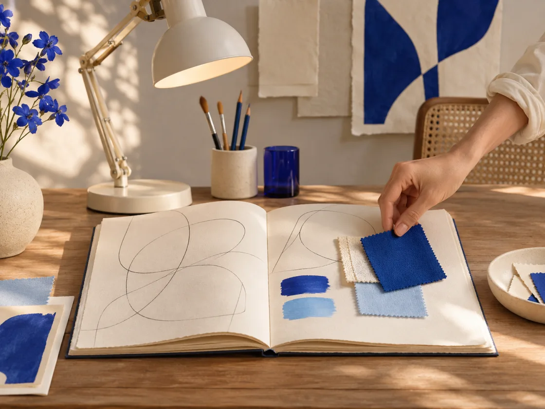
Community signup beside a studio photo
The tracks sit side by side when their container has room and stack in source order when it narrows.
Create a sample account
See how the same form works as its surroundings change.
View HTML
<div class="marketing-specimen" data-theme="paper" data-tone="paper" data-category="forms" data-treatment="account photo">
  <div class="marketing-section">
    <div class="marketing-composition" data-composition="split"><div class="thin-stack"><div class="marketing-intro thin-stack" data-space="s">

    <h3 class="marketing-display" id="marketing-forms-12-headline">Create a sample account</h3>
    <p>See how the same form works as its surroundings change.</p>

  </div><form class="marketing-form thin-stack thin-box" data-theme="neutral" data-space="xs" data-form-layout="stack" method="post" action="/patterns/marketing/header-signup/">
    <input type="hidden" name="example" value="forms:12">
    <p id="marketing-forms-12-form-hint">Demo only. Use sample information.</p>
    <div class="marketing-form-fields">
      <div class="thin-field">
    <label for="marketing-forms-12-name">Name</label>
    <input class="thin-input" id="marketing-forms-12-name" name="name" type="text" autocomplete="name" maxlength="120" required aria-describedby="marketing-forms-12-form-hint">
  </div>
<div class="thin-field">
    <label for="marketing-forms-12-email">Email address</label>
    <input class="thin-input" id="marketing-forms-12-email" name="email" type="email" autocomplete="email" maxlength="254" required aria-describedby="marketing-forms-12-form-hint">
  </div>
<div class="thin-field">
    <label for="marketing-forms-12-password">Sample password</label>
    <input class="thin-input" id="marketing-forms-12-password" name="password" type="password" autocomplete="off" maxlength="120" required aria-describedby="marketing-forms-12-form-hint">
  </div>
      <button class="thin-button" type="submit">Try account signup</button>
    </div>
  </form></div><figure class="marketing-image"><img src="/_astro/marketing-header-studio.saxM7xQc.webp" width="1120" height="840" alt="Open sketchbook and blue swatches on a studio desk" loading="lazy" decoding="async"></figure></div>
  </div>
</div>
Landscape before a sign-in card
Media and copy follow their authored sequence as the tracks stack.

Access your sample account
See how the same form works as its surroundings change.
View HTML
<div class="marketing-specimen" data-theme="neutral" data-tone="sky" data-category="forms" data-treatment="landscape login">
  <div class="marketing-section">
    <div class="marketing-composition" data-composition="media-first"><figure class="marketing-image"><img src="/_astro/marketing-landscape.WYjGY_8_.webp" width="1200" height="800" alt="Sunrise over a lake framed by mist and forested mountains" loading="lazy" decoding="async"></figure><div class="thin-stack"><div class="marketing-intro thin-stack" data-space="s">

    <h3 class="marketing-display" id="marketing-forms-13-headline">Access your sample account</h3>
    <p>See how the same form works as its surroundings change.</p>

  </div><form class="marketing-form thin-stack" data-space="xs" data-form-layout="stack" method="post" action="/patterns/marketing/header-signup/">
    <input type="hidden" name="example" value="forms:13">
    <p id="marketing-forms-13-form-hint">Demo only. Use sample information.</p>
    <div class="marketing-form-fields">
      <div class="thin-field">
    <label for="marketing-forms-13-email">Email address</label>
    <input class="thin-input" id="marketing-forms-13-email" name="email" type="email" autocomplete="email" maxlength="254" required aria-describedby="marketing-forms-13-form-hint">
  </div>
<div class="thin-field">
    <label for="marketing-forms-13-password">Sample password</label>
    <input class="thin-input" id="marketing-forms-13-password" name="password" type="password" autocomplete="off" maxlength="120" required aria-describedby="marketing-forms-13-form-hint">
  </div>
      <button class="thin-button" type="submit">Try sign-in</button>
    </div>
  </form></div></div>
  </div>
</div>
Editorial contact form
Text measure and logical spacing control the reading rhythm.
Ask the editorial team
See how the same form works as its surroundings change.
View HTML
<div class="marketing-specimen" data-theme="neutral" data-tone="neutral" data-category="forms" data-treatment="contact">
  <div class="marketing-section">
    <div class="marketing-composition" data-composition="editorial"><div class="marketing-intro thin-stack" data-space="s">

    <h3 class="marketing-display" id="marketing-forms-14-headline">Ask the editorial team</h3>
    <p>See how the same form works as its surroundings change.</p>

  </div><form class="marketing-form thin-stack" data-space="xs" data-form-layout="stack" method="post" action="/patterns/marketing/header-signup/">
    <input type="hidden" name="example" value="forms:14">
    <p id="marketing-forms-14-form-hint">Demo only. Use sample information.</p>
    <div class="marketing-form-fields">
      <div class="thin-field">
    <label for="marketing-forms-14-name">Name</label>
    <input class="thin-input" id="marketing-forms-14-name" name="name" type="text" autocomplete="name" maxlength="120" required aria-describedby="marketing-forms-14-form-hint">
  </div>
<div class="thin-field">
    <label for="marketing-forms-14-email">Email address</label>
    <input class="thin-input" id="marketing-forms-14-email" name="email" type="email" autocomplete="email" maxlength="254" required aria-describedby="marketing-forms-14-form-hint">
  </div>
<div class="thin-field marketing-message"><label for="marketing-forms-14-message">Message</label><textarea id="marketing-forms-14-message" name="message" class="thin-textarea" rows="4" maxlength="1000" required aria-describedby="marketing-forms-14-form-hint"></textarea></div>
      <button class="thin-button" type="submit">Send sample message</button>
    </div>
  </form></div>
  </div>
</div>
View shared CSS
Load Thin-Sky’s Foundation, Themes, Layouts, Components, and Marketing styles with these rules. Adapt the media, links, and form actions to your site.
@layer thin-patterns {
  .marketing-specimen {
    container: marketing-specimen / inline-size;
    color: var(--thin-color-text);
    background: var(--thin-color-surface);
  }

  .marketing-specimen[data-tone="sky"] { --thin-color-surface: oklch(96% .022 231); }
  .marketing-specimen[data-tone="mint"] { --thin-color-surface: oklch(96% .035 155); }
  .marketing-specimen[data-tone="rose"] { --thin-color-surface: oklch(96% .035 18); }
  .marketing-specimen[data-tone="amber"] { --thin-color-surface: oklch(96% .06 91); }
  .marketing-specimen[data-tone="blue"] { --thin-color-surface: oklch(39% .15 257); }
  .marketing-specimen[data-tone="violet"] { --thin-color-surface: oklch(35% .16 290); }
  .marketing-specimen[data-tone="gradient"] { background: linear-gradient(125deg, oklch(33% .13 272), oklch(37% .125 326)); }

  .marketing-specimen[data-treatment~="accent"]:not([data-tone="gradient"]) {
    background: radial-gradient(ellipse at 92% 88%, color-mix(in oklch, var(--thin-color-accent) 19%, transparent), transparent 60%), var(--thin-color-surface);
  }

  .marketing-section {
    --marketing-inset: clamp(var(--thin-space-m), 5cqi, 4rem);
    --marketing-gap: clamp(var(--thin-space-m), 4cqi, 3rem);
    display: grid;
    gap: var(--marketing-gap);
    padding-block: clamp(var(--thin-space-l), 5cqi, 4rem);
    padding-inline: var(--marketing-inset);
    overflow-wrap: anywhere;
  }

  .marketing-section > *,
  .marketing-composition > *,
  .marketing-nav > *,
  .marketing-card,
  .marketing-board,
  .marketing-section .thin-price-card {
    min-inline-size: 0;
  }

  .marketing-specimen[data-category="navigations"] .marketing-section,
  .marketing-specimen[data-treatment~="compact"]:not([data-category="headers"], [data-category="blog"]) .marketing-section {
    padding-block: var(--thin-space-m);
  }

  .marketing-section :where(ul[role="list"], dl) { margin-block: 0; }
  .marketing-section :where(a.thin-button, button) { max-inline-size: 100%; }

  .marketing-composition {
    display: grid;
    gap: var(--marketing-gap);
  }

  .marketing-composition:is([data-composition="split"], [data-composition="media-first"]) {
    grid-template-columns: repeat(auto-fit, minmax(min(100%, 19rem), 1fr));
    align-items: center;
  }

  .marketing-composition[data-composition="band"] {
    display: flex;
    flex-wrap: wrap;
    align-items: center;
    justify-content: space-between;
  }

  .marketing-composition[data-composition="band"] > .marketing-intro {
    flex: 1 1 17rem;
  }

  .marketing-composition[data-composition="center"] > .marketing-intro,
  .marketing-composition[data-composition="showcase"] > .marketing-intro {
    align-items: center;
    justify-self: center;
    text-align: center;
  }

  .marketing-composition:is([data-composition="center"], [data-composition="showcase"]) > .marketing-intro .marketing-actions {
    justify-content: center;
  }

  .marketing-composition[data-composition="editorial"] > .marketing-intro {
    inline-size: min(100%, 62ch);
  }

  .marketing-intro {
    inline-size: min(100%, 62ch);
  }

  .marketing-display {
    max-inline-size: 23ch;
    font-size: clamp(1.55rem, 1.05rem + 3.4cqi, 4rem);
    line-height: 1.07;
    letter-spacing: -.025em;
    text-wrap: balance;
  }

  .marketing-display em {
    color: var(--thin-color-accent);
    font-style: normal;
  }

  .marketing-specimen[data-treatment~="light"] .marketing-display { font-weight: 430; }
  .marketing-specimen[data-treatment~="uppercase"] :is(.marketing-display, .marketing-nav nav) { text-transform: uppercase; }
  .marketing-specimen[data-treatment~="pill"] .thin-button { border-radius: 2em; }

  .marketing-intro > p:not(.marketing-kicker) { max-inline-size: 54ch; }
  .marketing-kicker { color: var(--thin-color-accent); font-size: .9em; font-weight: 700; }
  .marketing-specimen[data-treatment~="pill"] .marketing-kicker { padding: .25em .8em; border: 1px solid currentColor; border-radius: 2em; inline-size: fit-content; }

  .marketing-nav {
    display: flex;
    flex-wrap: wrap;
    align-items: center;
    justify-content: space-between;
    gap: var(--thin-space-xs) var(--thin-space-m);
  }

  .marketing-nav[data-nav="start"] > nav { flex: 1 1 auto; }
  .marketing-nav[data-nav="band"] > nav { margin-inline-start: auto; }
  .marketing-nav[data-nav="wordmark"] { justify-content: center; }

  .marketing-nav > nav a,
  .marketing-nav-actions > a:not(.thin-button) {
    display: inline-flex;
    align-items: center;
    min-block-size: var(--thin-density-control);
  }

  .marketing-brand {
    color: var(--thin-color-text);
    font-size: 1.25em;
    font-weight: 780;
    text-decoration: none;
  }

  .marketing-stage,
  .marketing-launch,
  .marketing-cta,
  .marketing-foot {
    display: grid;
    gap: var(--marketing-gap);
  }

  .marketing-stage {
    position: relative;
    isolation: isolate;
  }

  .marketing-stage .marketing-nav {
    padding-block-end: var(--thin-space-s);
    border-block-end: 1px solid var(--thin-color-border);
  }

  .marketing-stage:has(.marketing-backdrop) {
    border-radius: var(--thin-radius-m);
    padding: var(--marketing-inset);
    overflow: clip;
  }

  .marketing-backdrop {
    position: absolute;
    inset: 0;
    z-index: -1;
    display: grid;
    background: oklch(24% .04 258);
  }

  .marketing-backdrop img {
    inline-size: 100%;
    block-size: 100%;
    object-fit: cover;
    opacity: .23;
  }

  .marketing-panel {
    padding: var(--marketing-inset);
    border: 1px solid var(--thin-color-border);
    border-radius: var(--thin-radius-m);
    background: var(--thin-color-surface-raised);
  }

  .marketing-notice {
    justify-content: center;
    padding: var(--thin-space-xs) var(--thin-space-m);
    border: 1px solid var(--thin-color-border);
    border-radius: var(--thin-radius-s);
    background: var(--thin-color-surface-raised);
  }

  .marketing-notice a { padding-block: var(--thin-space-2xs); }
  .marketing-notice-inset { max-inline-size: 62ch; margin-inline: auto; }

  .marketing-travel { display: grid; gap: var(--marketing-gap); align-items: center; }

  @container marketing-specimen (inline-size >= 52rem) {
    .marketing-travel { grid-template-columns: repeat(5, minmax(0, 1fr)); }
    .marketing-travel > figure { grid-column: 1 / 5; grid-row: 1; }
    .marketing-travel > .marketing-panel { grid-column: 4 / -1; grid-row: 1; }
  }

  .marketing-image :is(img, video) {
    inline-size: 100%;
    block-size: auto;
    border-radius: var(--thin-radius-m);
  }

  .marketing-image:only-child { inline-size: min(100%, 55rem); }
  .marketing-composition[data-composition="showcase"] > .marketing-image { inline-size: min(100%, 56rem); justify-self: center; }

  .marketing-collage {
    display: grid;
    grid-template-columns: 2fr 1fr;
    gap: var(--thin-space-xs);
  }

  .marketing-collage img {
    inline-size: 100%;
    block-size: 100%;
    min-block-size: 0;
    object-fit: cover;
    border-radius: var(--thin-radius-s);
  }

  .marketing-collage img:first-child { grid-row: span 2; }

  .marketing-art {
    display: grid;
    place-items: center;
    grid-template-columns: repeat(3, 1fr);
    gap: 6%;
    min-block-size: clamp(6rem, 25cqi, 16rem);
    padding: 10%;
    border-radius: var(--thin-radius-m);
    background: color-mix(in oklch, var(--thin-color-accent) 14%, var(--thin-color-surface-raised));
  }

  .marketing-art i {
    inline-size: 100%;
    aspect-ratio: 1;
    border: .2rem solid currentColor;
    border-radius: 50% 50% 12% 50%;
    color: var(--thin-color-accent);
    background: color-mix(in oklch, currentColor 18%, transparent);
  }

  .marketing-art i:nth-child(2) { border-radius: 16%; translate: 0 -18%; }
  .marketing-art i:nth-child(3) { border-radius: 50%; translate: 0 18%; }

  .marketing-board {
    padding: var(--thin-space-m);
    border: 1px solid var(--thin-color-border);
    border-block-start-width: .75rem;
    border-radius: var(--thin-radius-m);
    background: var(--thin-color-surface-raised);
  }

  .marketing-device { border-width: .65rem; }
  .marketing-board figcaption { margin: 0; font-weight: 700; }
  .marketing-board .thin-box { background: var(--thin-color-surface); }
  .marketing-code > figcaption { margin-block-end: var(--thin-space-xs); }
  .marketing-code pre { margin-block: 0; }

  .marketing-marks {
    align-items: stretch;
    text-align: center;
  }

  .marketing-marks > li {
    display: grid;
    place-items: center;
    min-block-size: 3rem;
    padding: var(--thin-space-xs);
    border: 1px solid var(--thin-color-border);
    border-radius: var(--thin-radius-s);
    font-family: var(--thin-font-display);
  }

  [data-treatment~="plain"] .marketing-marks > li { border-color: transparent; }
  [data-treatment~="tiles"] .marketing-marks > li { background: var(--thin-color-surface-raised); }
  .marketing-service-mark { font-weight: 750; }

  .marketing-metrics dd { margin: 0; color: var(--thin-color-accent); font-size: var(--thin-text-1); font-weight: 720; }

  .marketing-form {
    inline-size: min(100%, 36rem);
    text-align: start;
  }

  .marketing-form p { font-size: .9em; }
  .marketing-form-fields {
    display: grid;
    gap: var(--thin-space-xs);
    align-items: end;
  }

  .marketing-form-fields > * { min-inline-size: 0; }

  :is(.marketing-form[data-form-layout="inline"], .marketing-search) .marketing-form-fields {
    display: flex;
    flex-wrap: wrap;
  }

  :is(.marketing-form[data-form-layout="inline"], .marketing-search) .marketing-form-fields > :is(.thin-field, input) {
    flex: 1 1 12rem;
    inline-size: auto;
  }

  .marketing-search { inline-size: min(100%, 40rem); text-align: start; }

  .marketing-collection > * { min-inline-size: 0; }
  .marketing-card {
    block-size: 100%;
    padding: var(--thin-space-m);
    border: 1px solid var(--thin-color-border);
    border-radius: var(--thin-radius-m);
    background: var(--thin-color-surface-raised);
  }

  [data-treatment~="plain"] .marketing-card {
    border-color: transparent;
    background: transparent;
  }

  [data-treatment~="accent"] .marketing-card { border-block-start: .25rem solid var(--thin-color-accent); }

  .marketing-card > img {
    inline-size: 100%;
    aspect-ratio: 3 / 2;
    object-fit: cover;
    border-radius: var(--thin-radius-s);
  }

  .marketing-mark,
  .marketing-person-mark {
    display: inline-grid;
    place-items: center;
    inline-size: 2.6em;
    aspect-ratio: 1;
    border-radius: 50%;
    color: var(--thin-color-accent);
    background: color-mix(in oklch, var(--thin-color-accent) 14%, var(--thin-color-surface-raised));
    font-weight: 750;
  }

  .marketing-member { display: grid; align-content: start; gap: var(--thin-space-s); }
  .marketing-member > img { aspect-ratio: 1; }
  [data-treatment~="compact"] .marketing-member { grid-template-columns: auto minmax(0, 1fr); }

  .marketing-quotation { max-inline-size: 62ch; }
  [data-composition="center"] > .marketing-quotation { text-align: center; justify-self: center; }
  [data-composition="center"] > .marketing-quotation .marketing-attribution { justify-content: center; }
  .marketing-quotation blockquote { border: 0; padding: 0; color: var(--thin-color-text); font-size: var(--thin-text-1); }
  .marketing-attribution { display: flex; flex-wrap: wrap; align-items: center; gap: var(--thin-space-xs); }

  .marketing-questions { inline-size: 100%; text-align: start; }
  .marketing-questions[data-questions="grid"] {
    display: grid;
    grid-template-columns: repeat(auto-fit, minmax(min(100%, 17rem), 1fr));
    align-items: start;
  }

  .marketing-answers { display: grid; gap: var(--thin-space-s); }
  .marketing-questions details > p { margin-block-start: var(--thin-space-xs); }
  [data-treatment~="plain"] .marketing-questions details { background: transparent; }
  [data-treatment~="accent"] .marketing-questions details { border-inline: 0; border-block-start: 0; border-radius: 0; }

  .marketing-offers { min-inline-size: 0; }
  .marketing-offers fieldset { justify-self: start; }
  .marketing-yearly { display: none; }
  .marketing-offers:has(input[value="yearly"]:checked) .marketing-monthly { display: none; }
  .marketing-offers:has(input[value="yearly"]:checked) .marketing-yearly { display: inline; }
  .marketing-offers .thin-price small { font-size: .55em; }
  .marketing-plan-title small { color: var(--thin-color-accent); font-weight: 700; }
  .marketing-offers [data-composition="stack"] .thin-pricing { grid-template-columns: minmax(0, 1fr); }
  [data-treatment~="accent"] .marketing-offers .thin-price-card { border-block-start: .3rem solid var(--thin-color-accent); }

  .marketing-foot [data-composition="grid"] {
    grid-template-columns: repeat(auto-fit, minmax(min(100%, 12rem), 1fr));
  }

  .marketing-foot [data-composition="center"] {
    justify-items: center;
    text-align: center;
  }

  .marketing-foot nav > ul { margin-block-start: var(--thin-space-xs); }
  .marketing-foot [data-composition="grid"] nav > ul { display: grid; }
  .marketing-foot > small { border-block-start: 1px solid var(--thin-color-border); padding-block-start: var(--thin-space-s); }

  @container marketing-specimen (inline-size >= 46rem) {
    .marketing-stories > [data-lead] { grid-column: span 2; }
    .marketing-nav[data-nav="brand-middle"] {
      display: grid;
      grid-template-columns: minmax(0, 1fr) auto minmax(0, 1fr);
    }
    .marketing-nav[data-nav="brand-middle"] .marketing-nav-actions { justify-self: end; }
  }

  @media (forced-colors: active) {
    .marketing-backdrop { display: none; }
    .marketing-specimen, .marketing-card, .marketing-panel { background: Canvas; color: CanvasText; }
    .marketing-kicker, .marketing-display em { color: CanvasText; }
  }
}