Headers
39 examples. Use Compact to see how the same HTML reflows.
Centered launch
A bounded measure and wrapping actions keep the composition centered.
Make room for your next idea
Make space for the story, the people behind it, and what readers can do next.
View HTML
<div class="marketing-specimen" data-theme="neutral" data-tone="neutral" data-category="headers">
  <div class="marketing-section">
    <header class="marketing-stage" aria-labelledby="marketing-headers-01-headline">

    <div class="marketing-nav" data-nav="center">
    <a href="/patterns/marketing/" class="marketing-brand">Fieldwork</a><nav aria-label="Fieldwork destinations 01"><ul class="thin-cluster" role="list"><li><a href="/patterns/marketing/">Patterns</a></li>
<li><a href="/layouts/">Layouts</a></li>
<li><a href="/guides/">Guides</a></li>
<li><a href="/patterns/marketing/examples/">Examples</a></li></ul></nav>
    <div class="thin-cluster marketing-nav-actions">

    <a href="/guides/quick-start/" class="thin-button">Get started</a>
  </div>
  </div><div class="marketing-launch"><div class="marketing-composition" data-composition="center"><div class="marketing-intro thin-stack" data-space="s">

    <h3 class="marketing-display" id="marketing-headers-01-headline">Make room for your next idea</h3>
    <p>Make space for the story, the people behind it, and what readers can do next.</p>
    <div class="thin-cluster marketing-actions"><a href="/guides/quick-start/" class="thin-button">Get started</a><a href="/guides/marketing-site/">Learn more</a></div>
  </div></div></div>
  </header>
  </div>
</div>
Centered email signup
A bounded measure and wrapping actions keep the composition centered.
Fieldwork Studio
A clearer way to work together
Make space for the story, the people behind it, and what readers can do next.
View HTML
<div class="marketing-specimen" data-theme="night-signal" data-tone="ink" data-category="headers" data-treatment="signup pill">
  <div class="marketing-section">
    <header class="marketing-stage" aria-labelledby="marketing-headers-02-headline">

    <div class="marketing-nav" data-nav="center">
    <a href="/patterns/marketing/" class="marketing-brand">Fieldwork</a><nav aria-label="Fieldwork destinations 02"><ul class="thin-cluster" role="list"><li><a href="/patterns/marketing/">Patterns</a></li>
<li><a href="/layouts/">Layouts</a></li>
<li><a href="/guides/">Guides</a></li>
<li><a href="/patterns/marketing/examples/">Examples</a></li></ul></nav>
    <div class="thin-cluster marketing-nav-actions">

    <a href="/guides/quick-start/" class="thin-button">Get started</a>
  </div>
  </div><div class="marketing-launch"><div class="marketing-composition" data-composition="center"><div class="marketing-intro thin-stack" data-space="s">
    <p class="marketing-kicker">Fieldwork Studio</p>
    <h3 class="marketing-display" id="marketing-headers-02-headline">A clearer way to work together</h3>
    <p>Make space for the story, the people behind it, and what readers can do next.</p>
    <form class="marketing-form thin-stack" data-space="xs" data-form-layout="inline" method="post" action="/patterns/marketing/header-signup/">
    <input type="hidden" name="example" value="headers:02">
    <p id="marketing-headers-02-form-hint">Demo only. Use sample information.</p>
    <div class="marketing-form-fields">
      <div class="thin-field">
    <label for="marketing-headers-02-email">Email address</label>
    <input class="thin-input" id="marketing-headers-02-email" name="email" type="email" autocomplete="email" maxlength="254" required aria-describedby="marketing-headers-02-form-hint">
  </div>
      <button class="thin-button" type="submit">Try signup</button>
    </div>
  </form>
  </div></div></div>
  </header>
  </div>
</div>
Full-bleed woodland launch
A bounded measure and wrapping actions keep the composition centered.

Your next idea starts here
Make space for the story, the people behind it, and what readers can do next.
View HTML
<div class="marketing-specimen" data-theme="night-signal" data-tone="violet" data-category="headers" data-treatment="landscape">
  <div class="marketing-section">
    <header class="marketing-stage" aria-labelledby="marketing-headers-03-headline">
    <div class="marketing-backdrop"><img src="/_astro/marketing-landscape.WYjGY_8_.webp" width="1200" height="800" alt="" loading="lazy" decoding="async"></div>
    <div class="marketing-nav" data-nav="center">
    <a href="/patterns/marketing/" class="marketing-brand">Fieldwork</a><nav aria-label="Fieldwork destinations 03"><ul class="thin-cluster" role="list"><li><a href="/patterns/marketing/">Patterns</a></li>
<li><a href="/layouts/">Layouts</a></li>
<li><a href="/guides/">Guides</a></li>
<li><a href="/patterns/marketing/examples/">Examples</a></li></ul></nav>
    <div class="thin-cluster marketing-nav-actions">

    <a href="/guides/quick-start/" class="thin-button">Get started</a>
  </div>
  </div><div class="marketing-launch"><div class="marketing-composition" data-composition="center"><div class="marketing-intro thin-stack" data-space="s">

    <h3 class="marketing-display" id="marketing-headers-03-headline">Your next idea starts here</h3>
    <p>Make space for the story, the people behind it, and what readers can do next.</p>
    <div class="thin-cluster marketing-actions"><a href="/guides/quick-start/" class="thin-button">Get started</a><a href="/guides/marketing-site/">Learn more</a></div>
  </div></div></div>
  </header>
  </div>
</div>
Centered pitch with wide product preview
The introduction keeps its measure while the supporting content can use the wider track.
Give your business a stronger start
Make space for the story, the people behind it, and what readers can do next.
- Planned
Collect references
- In progress
Draft the story
- Ready
Review the layout
View HTML
<div class="marketing-specimen" data-theme="neutral" data-tone="neutral" data-category="headers" data-treatment="board">
  <div class="marketing-section">
    <header class="marketing-stage" aria-labelledby="marketing-headers-04-headline">

    <div class="marketing-nav" data-nav="showcase">
    <a href="/patterns/marketing/" class="marketing-brand">Fieldwork</a><nav aria-label="Fieldwork destinations 04"><ul class="thin-cluster" role="list"><li><a href="/patterns/marketing/">Patterns</a></li>
<li><a href="/layouts/">Layouts</a></li>
<li><a href="/guides/">Guides</a></li>
<li><a href="/patterns/marketing/examples/">Examples</a></li></ul></nav>
    <div class="thin-cluster marketing-nav-actions">

    <a href="/guides/quick-start/" class="thin-button">Get started</a>
  </div>
  </div><div class="marketing-launch"><div class="marketing-composition" data-composition="showcase"><div class="marketing-intro thin-stack" data-space="s">

    <h3 class="marketing-display" id="marketing-headers-04-headline">Give your business a stronger start</h3>
    <p>Make space for the story, the people behind it, and what readers can do next.</p>
    <div class="thin-cluster marketing-actions"><a href="/guides/quick-start/" class="thin-button">Get started</a><a href="/guides/marketing-site/">Learn more</a></div>
  </div><figure class="marketing-board thin-stack" data-space="s">
    <figcaption>Project overview</figcaption>
    <ul class="thin-grid marketing-collection " role="list" style="--thin-grid-min: 9rem"><li class="thin-box"><strong>Planned</strong><p>Collect references</p></li><li class="thin-box"><strong>In progress</strong><p>Draft the story</p></li><li class="thin-box"><strong>Ready</strong><p>Review the layout</p></li></ul>
  </figure></div></div>
  </header>
  </div>
</div>
Editorial copy above a project dashboard
Text measure and logical spacing control the reading rhythm.
Keep the whole team in the loop
Make space for the story, the people behind it, and what readers can do next.
- Planned
Collect references
- In progress
Draft the story
- Ready
Review the layout
View HTML
<div class="marketing-specimen" data-theme="paper" data-tone="paper" data-category="headers" data-treatment="board">
  <div class="marketing-section">
    <header class="marketing-stage" aria-labelledby="marketing-headers-05-headline">

    <div class="marketing-nav" data-nav="editorial">
    <a href="/patterns/marketing/" class="marketing-brand">Fieldwork</a><nav aria-label="Fieldwork destinations 05"><ul class="thin-cluster" role="list"><li><a href="/patterns/marketing/">Patterns</a></li>
<li><a href="/layouts/">Layouts</a></li>
<li><a href="/guides/">Guides</a></li>
<li><a href="/patterns/marketing/examples/">Examples</a></li></ul></nav>
    <div class="thin-cluster marketing-nav-actions">

    <a href="/guides/quick-start/" class="thin-button">Get started</a>
  </div>
  </div><div class="marketing-launch"><div class="marketing-composition" data-composition="editorial"><div class="marketing-intro thin-stack" data-space="s">

    <h3 class="marketing-display" id="marketing-headers-05-headline">Keep the whole team in the loop</h3>
    <p>Make space for the story, the people behind it, and what readers can do next.</p>
    <div class="thin-cluster marketing-actions"><a href="/guides/quick-start/" class="thin-button">Get started</a><a href="/guides/marketing-site/">Learn more</a></div>
  </div><figure class="marketing-board thin-stack" data-space="s">
    <figcaption>Project overview</figcaption>
    <ul class="thin-grid marketing-collection " role="list" style="--thin-grid-min: 9rem"><li class="thin-box"><strong>Planned</strong><p>Collect references</p></li><li class="thin-box"><strong>In progress</strong><p>Draft the story</p></li><li class="thin-box"><strong>Ready</strong><p>Review the layout</p></li></ul>
  </figure></div></div>
  </header>
  </div>
</div>
Campaign dashboard and partner strip
The tracks sit side by side when their container has room and stack in source order when it narrows.
Plan your next campaign
Make space for the story, the people behind it, and what readers can do next.
- Planned
Collect references
- In progress
Draft the story
- Ready
Review the layout
- Fieldwork
- Relay
- Northline
- Afterlight
- Commonform
View HTML
<div class="marketing-specimen" data-theme="neutral" data-tone="neutral" data-category="headers" data-treatment="board logos">
  <div class="marketing-section">
    <header class="marketing-stage" aria-labelledby="marketing-headers-06-headline">

    <div class="marketing-nav" data-nav="split">
    <a href="/patterns/marketing/" class="marketing-brand">Fieldwork</a><nav aria-label="Fieldwork destinations 06"><ul class="thin-cluster" role="list"><li><a href="/patterns/marketing/">Patterns</a></li>
<li><a href="/layouts/">Layouts</a></li>
<li><a href="/guides/">Guides</a></li>
<li><a href="/patterns/marketing/examples/">Examples</a></li></ul></nav>
    <div class="thin-cluster marketing-nav-actions">

    <a href="/guides/quick-start/" class="thin-button">Get started</a>
  </div>
  </div><div class="marketing-launch"><div class="marketing-composition" data-composition="split"><div class="marketing-intro thin-stack" data-space="s">

    <h3 class="marketing-display" id="marketing-headers-06-headline">Plan your next campaign</h3>
    <p>Make space for the story, the people behind it, and what readers can do next.</p>
    <div class="thin-cluster marketing-actions"><a href="/guides/quick-start/" class="thin-button">Get started</a><a href="/guides/marketing-site/">Learn more</a></div>
  </div><figure class="marketing-board thin-stack" data-space="s">
    <figcaption>Project overview</figcaption>
    <ul class="thin-grid marketing-collection " role="list" style="--thin-grid-min: 9rem"><li class="thin-box"><strong>Planned</strong><p>Collect references</p></li><li class="thin-box"><strong>In progress</strong><p>Draft the story</p></li><li class="thin-box"><strong>Ready</strong><p>Review the layout</p></li></ul>
  </figure></div><ul class="thin-grid marketing-collection marketing-marks" role="list" style="--thin-grid-min: 8rem"><li><strong>Fieldwork</strong></li><li><strong>Relay</strong></li><li><strong>Northline</strong></li><li><strong>Afterlight</strong></li><li><strong>Commonform</strong></li></ul></div>
  </header>
  </div>
</div>
Workshop backdrop with signup panel
The tracks sit side by side when their container has room and stack in source order when it narrows.

Turn a good idea into a living
Make space for the story, the people behind it, and what readers can do next.
View HTML
<div class="marketing-specimen" data-theme="night-signal" data-tone="ink" data-category="headers" data-treatment="workshop panel">
  <div class="marketing-section">
    <header class="marketing-stage" aria-labelledby="marketing-headers-07-headline">
    <div class="marketing-backdrop"><img src="/_astro/marketing-workshop.CAfo7i-M.webp" width="1200" height="800" alt="" loading="lazy" decoding="async"></div>
    <div class="marketing-nav" data-nav="split">
    <a href="/patterns/marketing/" class="marketing-brand">Fieldwork</a><nav aria-label="Fieldwork destinations 07"><ul class="thin-cluster" role="list"><li><a href="/patterns/marketing/">Patterns</a></li>
<li><a href="/layouts/">Layouts</a></li>
<li><a href="/guides/">Guides</a></li>
<li><a href="/patterns/marketing/examples/">Examples</a></li></ul></nav>
    <div class="thin-cluster marketing-nav-actions">

    <a href="/guides/quick-start/" class="thin-button">Get started</a>
  </div>
  </div><div class="marketing-launch"><div class="marketing-composition" data-composition="split"><div class="marketing-intro thin-stack" data-space="s">

    <h3 class="marketing-display" id="marketing-headers-07-headline">Turn a good idea into a living</h3>
    <p>Make space for the story, the people behind it, and what readers can do next.</p>
    <div class="thin-cluster marketing-actions"><a href="/guides/quick-start/" class="thin-button">Get started</a><a href="/guides/marketing-site/">Learn more</a></div>
  </div><form class="marketing-form thin-stack thin-box" data-theme="neutral" data-space="xs" data-form-layout="stack" method="post" action="/patterns/marketing/header-signup/">
    <input type="hidden" name="example" value="headers:07">
    <p id="marketing-headers-07-form-hint">Demo only. Use sample information.</p>
    <div class="marketing-form-fields">
      <div class="thin-field">
    <label for="marketing-headers-07-email">Email address</label>
    <input class="thin-input" id="marketing-headers-07-email" name="email" type="email" autocomplete="email" maxlength="254" required aria-describedby="marketing-headers-07-form-hint">
  </div>
      <button class="thin-button" type="submit">Try signup</button>
    </div>
  </form></div></div>
  </header>
  </div>
</div>
Color-washed signup panel
The tracks sit side by side when their container has room and stack in source order when it narrows.
Design, build, and share
Make space for the story, the people behind it, and what readers can do next.
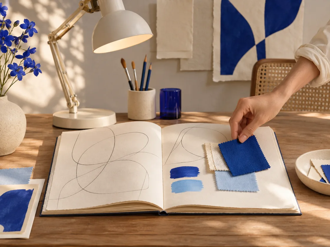
View HTML
<div class="marketing-specimen" data-theme="night-signal" data-tone="violet" data-category="headers" data-treatment="photo panel">
  <div class="marketing-section">
    <header class="marketing-stage" aria-labelledby="marketing-headers-08-headline">

    <div class="marketing-nav" data-nav="split">
    <a href="/patterns/marketing/" class="marketing-brand">Fieldwork</a><nav aria-label="Fieldwork destinations 08"><ul class="thin-cluster" role="list"><li><a href="/patterns/marketing/">Patterns</a></li>
<li><a href="/layouts/">Layouts</a></li>
<li><a href="/guides/">Guides</a></li>
<li><a href="/patterns/marketing/examples/">Examples</a></li></ul></nav>
    <div class="thin-cluster marketing-nav-actions">

    <a href="/guides/quick-start/" class="thin-button">Get started</a>
  </div>
  </div><div class="marketing-launch"><div class="marketing-composition" data-composition="split"><div class="marketing-intro thin-stack" data-space="s">

    <h3 class="marketing-display" id="marketing-headers-08-headline">Design, build, and share</h3>
    <p>Make space for the story, the people behind it, and what readers can do next.</p>
    <div class="thin-cluster marketing-actions"><a href="/guides/quick-start/" class="thin-button">Get started</a><a href="/guides/marketing-site/">Learn more</a></div>
  </div><form class="marketing-form thin-stack thin-box" data-theme="neutral" data-space="xs" data-form-layout="stack" method="post" action="/patterns/marketing/header-signup/">
    <input type="hidden" name="example" value="headers:08">
    <p id="marketing-headers-08-form-hint">Demo only. Use sample information.</p>
    <div class="marketing-form-fields">
      <div class="thin-field">
    <label for="marketing-headers-08-email">Email address</label>
    <input class="thin-input" id="marketing-headers-08-email" name="email" type="email" autocomplete="email" maxlength="254" required aria-describedby="marketing-headers-08-form-hint">
  </div>
      <button class="thin-button" type="submit">Try signup</button>
    </div>
  </form></div><figure class="marketing-image"><img src="/_astro/marketing-header-studio.saxM7xQc.webp" width="1120" height="840" alt="Open sketchbook and blue swatches on a studio desk" loading="lazy" decoding="async"></figure></div>
  </header>
  </div>
</div>
Accent stage with an inset dashboard
The introduction keeps its measure while the supporting content can use the wider track.
Build your site in less time
Make space for the story, the people behind it, and what readers can do next.
- Planned
Collect references
- In progress
Draft the story
- Ready
Review the layout
View HTML
<div class="marketing-specimen" data-theme="night-signal" data-tone="blue" data-category="headers" data-treatment="board">
  <div class="marketing-section">
    <header class="marketing-stage" aria-labelledby="marketing-headers-09-headline">

    <div class="marketing-nav" data-nav="showcase">
    <a href="/patterns/marketing/" class="marketing-brand">Fieldwork</a><nav aria-label="Fieldwork destinations 09"><ul class="thin-cluster" role="list"><li><a href="/patterns/marketing/">Patterns</a></li>
<li><a href="/layouts/">Layouts</a></li>
<li><a href="/guides/">Guides</a></li>
<li><a href="/patterns/marketing/examples/">Examples</a></li></ul></nav>
    <div class="thin-cluster marketing-nav-actions">

    <a href="/guides/quick-start/" class="thin-button">Get started</a>
  </div>
  </div><div class="marketing-launch"><div class="marketing-composition" data-composition="showcase"><div class="marketing-intro thin-stack" data-space="s">

    <h3 class="marketing-display" id="marketing-headers-09-headline">Build your site in less time</h3>
    <p>Make space for the story, the people behind it, and what readers can do next.</p>
    <div class="thin-cluster marketing-actions"><a href="/guides/quick-start/" class="thin-button">Get started</a><a href="/guides/marketing-site/">Learn more</a></div>
  </div><figure class="marketing-board thin-stack" data-space="s">
    <figcaption>Project overview</figcaption>
    <ul class="thin-grid marketing-collection " role="list" style="--thin-grid-min: 9rem"><li class="thin-box"><strong>Planned</strong><p>Collect references</p></li><li class="thin-box"><strong>In progress</strong><p>Draft the story</p></li><li class="thin-box"><strong>Ready</strong><p>Review the layout</p></li></ul>
  </figure></div></div>
  </header>
  </div>
</div>
Split studio imagery
The tracks sit side by side when their container has room and stack in source order when it narrows.
Give good design a place to start
Make space for the story, the people behind it, and what readers can do next.
View HTML
<div class="marketing-specimen" data-theme="neutral" data-tone="sky" data-category="headers" data-treatment="photo">
  <div class="marketing-section">
    <header class="marketing-stage" aria-labelledby="marketing-headers-10-headline">

    <div class="marketing-nav" data-nav="split">
    <a href="/patterns/marketing/" class="marketing-brand">Fieldwork</a><nav aria-label="Fieldwork destinations 10"><ul class="thin-cluster" role="list"><li><a href="/patterns/marketing/">Patterns</a></li>
<li><a href="/layouts/">Layouts</a></li>
<li><a href="/guides/">Guides</a></li>
<li><a href="/patterns/marketing/examples/">Examples</a></li></ul></nav>
    <div class="thin-cluster marketing-nav-actions">

    <a href="/guides/quick-start/" class="thin-button">Get started</a>
  </div>
  </div><div class="marketing-launch"><div class="marketing-composition" data-composition="split"><div class="marketing-intro thin-stack" data-space="s">

    <h3 class="marketing-display" id="marketing-headers-10-headline">Give good design a place to start</h3>
    <p>Make space for the story, the people behind it, and what readers can do next.</p>
    <div class="thin-cluster marketing-actions"><a href="/guides/quick-start/" class="thin-button">Get started</a><a href="/guides/marketing-site/">Learn more</a></div>
  </div><figure class="marketing-image"><img src="/_astro/marketing-header-studio.saxM7xQc.webp" width="1120" height="840" alt="Open sketchbook and blue swatches on a studio desk" loading="lazy" decoding="async"></figure></div></div>
  </header>
  </div>
</div>
Left-aligned design preview
Text measure and logical spacing control the reading rhythm.
Shape your next design
Make space for the story, the people behind it, and what readers can do next.
- Planned
Collect references
- In progress
Draft the story
- Ready
Review the layout
View HTML
<div class="marketing-specimen" data-theme="neutral" data-tone="neutral" data-category="headers" data-treatment="board video">
  <div class="marketing-section">
    <header class="marketing-stage" aria-labelledby="marketing-headers-11-headline">

    <div class="marketing-nav" data-nav="editorial">
    <a href="/patterns/marketing/" class="marketing-brand">Fieldwork</a><nav aria-label="Fieldwork destinations 11"><ul class="thin-cluster" role="list"><li><a href="/patterns/marketing/">Patterns</a></li>
<li><a href="/layouts/">Layouts</a></li>
<li><a href="/guides/">Guides</a></li>
<li><a href="/patterns/marketing/examples/">Examples</a></li></ul></nav>
    <div class="thin-cluster marketing-nav-actions">

    <a href="/guides/quick-start/" class="thin-button">Get started</a>
  </div>
  </div><div class="marketing-launch"><div class="marketing-composition" data-composition="editorial"><div class="marketing-intro thin-stack" data-space="s">

    <h3 class="marketing-display" id="marketing-headers-11-headline">Shape your next design</h3>
    <p>Make space for the story, the people behind it, and what readers can do next.</p>
    <div class="thin-cluster marketing-actions"><a href="/guides/quick-start/" class="thin-button">Get started</a><a href="/examples/video-player/">Watch the demo</a></div>
  </div><figure class="marketing-board thin-stack" data-space="s">
    <figcaption>Project overview</figcaption>
    <ul class="thin-grid marketing-collection " role="list" style="--thin-grid-min: 9rem"><li class="thin-box"><strong>Planned</strong><p>Collect references</p></li><li class="thin-box"><strong>In progress</strong><p>Draft the story</p></li><li class="thin-box"><strong>Ready</strong><p>Review the layout</p></li></ul>
  </figure></div></div>
  </header>
  </div>
</div>
Centered launch with product tiles
The introduction keeps its measure while the supporting content can use the wider track.
Tools for building faster
Make space for the story, the people behind it, and what readers can do next.
- Planned
Collect references
- In progress
Draft the story
- Ready
Review the layout
- Published
Share the edition
View HTML
<div class="marketing-specimen" data-theme="neutral" data-tone="sky" data-category="headers" data-treatment="board tiles">
  <div class="marketing-section">
    <header class="marketing-stage" aria-labelledby="marketing-headers-12-headline">

    <div class="marketing-nav" data-nav="showcase">
    <a href="/patterns/marketing/" class="marketing-brand">Fieldwork</a><nav aria-label="Fieldwork destinations 12"><ul class="thin-cluster" role="list"><li><a href="/patterns/marketing/">Patterns</a></li>
<li><a href="/layouts/">Layouts</a></li>
<li><a href="/guides/">Guides</a></li>
<li><a href="/patterns/marketing/examples/">Examples</a></li></ul></nav>
    <div class="thin-cluster marketing-nav-actions">

    <a href="/guides/quick-start/" class="thin-button">Get started</a>
  </div>
  </div><div class="marketing-launch"><div class="marketing-composition" data-composition="showcase"><div class="marketing-intro thin-stack" data-space="s">

    <h3 class="marketing-display" id="marketing-headers-12-headline">Tools for building faster</h3>
    <p>Make space for the story, the people behind it, and what readers can do next.</p>
    <div class="thin-cluster marketing-actions"><a href="/guides/quick-start/" class="thin-button">Get started</a><a href="/guides/marketing-site/">Learn more</a></div>
  </div><figure class="marketing-board thin-stack" data-space="s">
    <figcaption>Project overview</figcaption>
    <ul class="thin-grid marketing-collection " role="list" style="--thin-grid-min: 9rem"><li class="thin-box"><strong>Planned</strong><p>Collect references</p></li><li class="thin-box"><strong>In progress</strong><p>Draft the story</p></li><li class="thin-box"><strong>Ready</strong><p>Review the layout</p></li><li class="thin-box"><strong>Published</strong><p>Share the edition</p></li></ul>
  </figure></div></div>
  </header>
  </div>
</div>
Illustrated download and integrations
The tracks sit side by side when their container has room and stack in source order when it narrows.
Take your next idea from sketch to screen
Make space for the story, the people behind it, and what readers can do next.
- Fieldwork
- Relay
- Northline
- Afterlight
- Commonform
View HTML
<div class="marketing-specimen" data-theme="neutral" data-tone="amber" data-category="headers" data-treatment="art logos">
  <div class="marketing-section">
    <header class="marketing-stage" aria-labelledby="marketing-headers-13-headline">

    <div class="marketing-nav" data-nav="split">
    <a href="/patterns/marketing/" class="marketing-brand">Fieldwork</a><nav aria-label="Fieldwork destinations 13"><ul class="thin-cluster" role="list"><li><a href="/patterns/marketing/">Patterns</a></li>
<li><a href="/layouts/">Layouts</a></li>
<li><a href="/guides/">Guides</a></li>
<li><a href="/patterns/marketing/examples/">Examples</a></li></ul></nav>
    <div class="thin-cluster marketing-nav-actions">

    <a href="/guides/quick-start/" class="thin-button">Get started</a>
  </div>
  </div><div class="marketing-launch"><div class="marketing-composition" data-composition="split"><div class="marketing-intro thin-stack" data-space="s">

    <h3 class="marketing-display" id="marketing-headers-13-headline">Take your next idea from sketch to screen</h3>
    <p>Make space for the story, the people behind it, and what readers can do next.</p>
    <div class="thin-cluster marketing-actions"><a href="/guides/quick-start/" class="thin-button">Get started</a><a href="/guides/marketing-site/">Learn more</a></div>
  </div><div class="marketing-art" aria-hidden="true"><i></i><i></i><i></i></div></div><ul class="thin-grid marketing-collection marketing-marks" role="list" style="--thin-grid-min: 8rem"><li><strong>Fieldwork</strong></li><li><strong>Relay</strong></li><li><strong>Northline</strong></li><li><strong>Afterlight</strong></li><li><strong>Commonform</strong></li></ul></div>
  </header>
  </div>
</div>
Split manifesto above a dashboard
The tracks sit side by side when their container has room and stack in source order when it narrows.
Design. Build. Launch.
Make space for the story, the people behind it, and what readers can do next.
- Sample projects
- 128
- Sample editions
- 24
- Contributors
- 16
- Planned
Collect references
- In progress
Draft the story
- Ready
Review the layout
View HTML
<div class="marketing-specimen" data-theme="night-signal" data-tone="ink" data-category="headers" data-treatment="metrics board compact">
  <div class="marketing-section">
    <header class="marketing-stage" aria-labelledby="marketing-headers-14-headline">

    <div class="marketing-nav" data-nav="split">
    <a href="/patterns/marketing/" class="marketing-brand">Fieldwork</a>
    <div class="thin-cluster marketing-nav-actions">

    <a href="/guides/quick-start/" class="thin-button">Get early access</a>
  </div>
  </div><div class="marketing-launch"><div class="marketing-composition" data-composition="split"><div class="marketing-intro thin-stack" data-space="s">

    <h3 class="marketing-display" id="marketing-headers-14-headline">Design. Build. Launch.</h3>
    <p>Make space for the story, the people behind it, and what readers can do next.</p>
    <div class="thin-cluster marketing-actions"><a href="/guides/quick-start/" class="thin-button">Get started</a></div><dl class="marketing-metrics thin-cluster"><div><dt>Sample projects</dt><dd>128</dd></div><div><dt>Sample editions</dt><dd>24</dd></div><div><dt>Contributors</dt><dd>16</dd></div></dl>
  </div><figure class="marketing-board thin-stack" data-space="s">
    <figcaption>Project overview</figcaption>
    <ul class="thin-grid marketing-collection " role="list" style="--thin-grid-min: 9rem"><li class="thin-box"><strong>Planned</strong><p>Collect references</p></li><li class="thin-box"><strong>In progress</strong><p>Draft the story</p></li><li class="thin-box"><strong>Ready</strong><p>Review the layout</p></li></ul>
  </figure></div></div>
  </header>
  </div>
</div>
Accent rule and centered project board
The introduction keeps its measure while the supporting content can use the wider track.
Build a landing page with confidence
Make space for the story, the people behind it, and what readers can do next.
- Planned
Collect references
- In progress
Draft the story
- Ready
Review the layout
View HTML
<div class="marketing-specimen" data-theme="neutral" data-tone="neutral" data-category="headers" data-treatment="board announcement accent">
  <div class="marketing-section">
    <aside class="marketing-notice thin-cluster" aria-label="Release announcement"><p>New field edition available</p><a href="/guides/marketing-site/">Read the guide</a><a href="/patterns/marketing/examples/">Browse the collection</a></aside><header class="marketing-stage" aria-labelledby="marketing-headers-15-headline">

    <div class="marketing-nav" data-nav="showcase">
    <a href="/patterns/marketing/" class="marketing-brand">Fieldwork</a><nav aria-label="Fieldwork destinations 15"><ul class="thin-cluster" role="list">
    <li><a href="/patterns/marketing/">Overview</a></li>
    <li><details><summary>Product</summary><ul class="thin-cluster" role="list"><li><a href="/layouts/">Layouts</a></li>
<li><a href="/guides/">Guides</a></li>
<li><a href="/patterns/marketing/examples/">Examples</a></li></ul></details></li>
    <li><a href="/patterns/marketing/examples/pricing/">Plans</a></li>
  </ul></nav>
    <div class="thin-cluster marketing-nav-actions">

    <a href="/guides/quick-start/" class="thin-button">Get started</a>
  </div>
  </div><div class="marketing-launch"><div class="marketing-composition" data-composition="showcase"><div class="marketing-intro thin-stack" data-space="s">

    <h3 class="marketing-display" id="marketing-headers-15-headline">Build a landing page <em>with confidence</em></h3>
    <p>Make space for the story, the people behind it, and what readers can do next.</p>
    <div class="thin-cluster marketing-actions"><a href="/guides/quick-start/" class="thin-button">Get started</a><a href="/guides/marketing-site/">Learn more</a></div>
  </div><figure class="marketing-board thin-stack" data-space="s">
    <figcaption>Project overview</figcaption>
    <ul class="thin-grid marketing-collection " role="list" style="--thin-grid-min: 9rem"><li class="thin-box"><strong>Planned</strong><p>Collect references</p></li><li class="thin-box"><strong>In progress</strong><p>Draft the story</p></li><li class="thin-box"><strong>Ready</strong><p>Review the layout</p></li></ul>
  </figure></div></div>
  </header>
  </div>
</div>
Dark split with a workshop film
The tracks sit side by side when their container has room and stack in source order when it narrows.
Find the people your work is for
Make space for the story, the people behind it, and what readers can do next.
View HTML
<div class="marketing-specimen" data-theme="night-signal" data-tone="ink" data-category="headers" data-treatment="video accent">
  <div class="marketing-section">
    <header class="marketing-stage" aria-labelledby="marketing-headers-16-headline">

    <div class="marketing-nav" data-nav="split">
    <a href="/patterns/marketing/" class="marketing-brand">Fieldwork</a><nav aria-label="Fieldwork destinations 16"><ul class="thin-cluster" role="list">
    <li><a href="/patterns/marketing/">Overview</a></li>
    <li><details><summary>Product</summary><ul class="thin-cluster" role="list"><li><a href="/layouts/">Layouts</a></li>
<li><a href="/guides/">Guides</a></li>
<li><a href="/patterns/marketing/examples/">Examples</a></li></ul></details></li>
    <li><a href="/patterns/marketing/examples/pricing/">Plans</a></li>
  </ul></nav>
    <div class="thin-cluster marketing-nav-actions">

    <a href="/guides/quick-start/" class="thin-button">Get started</a>
  </div>
  </div><div class="marketing-launch"><div class="marketing-composition" data-composition="split"><div class="marketing-intro thin-stack" data-space="s">

    <h3 class="marketing-display" id="marketing-headers-16-headline">Find the people your work <em>is for</em></h3>
    <p>Make space for the story, the people behind it, and what readers can do next.</p>
    <div class="thin-cluster marketing-actions"><a href="/guides/quick-start/" class="thin-button">Get started</a><a href="/examples/video-player/">Watch the demo</a></div>
  </div><figure class="marketing-image marketing-video">
      <video controls playsinline preload="none" poster="/_astro/marketing-workshop.CAfo7i-M.webp" aria-label="Sample video: a blue square moves across a dark background">
        <source src="/_astro/moving-square.CCnV5rMR.mp4" type="video/mp4">
        <track kind="captions" src="/examples/square-captions.vtt" srclang="en" label="English" default>
        <a href="/examples/video-player/">Open the sample video</a>
      </video>
      <figcaption>Sample video and captions</figcaption>
    </figure></div></div>
  </header>
  </div>
</div>
Illustrated launch with a supporting action band
The tracks sit side by side when their container has room and stack in source order when it narrows.
Crafted to fit the way you work
Make space for the story, the people behind it, and what readers can do next.
View HTML
<div class="marketing-specimen" data-theme="neutral" data-tone="mint" data-category="headers" data-treatment="art announcement">
  <div class="marketing-section">
    <aside class="marketing-notice thin-cluster" aria-label="Release announcement"><p>New field edition available</p><a href="/guides/marketing-site/">Read the guide</a><a href="/patterns/marketing/examples/">Browse the collection</a></aside><header class="marketing-stage" aria-labelledby="marketing-headers-17-headline">

    <div class="marketing-nav" data-nav="split">
    <a href="/patterns/marketing/" class="marketing-brand">Fieldwork</a><nav aria-label="Fieldwork destinations 17"><ul class="thin-cluster" role="list"><li><a href="/patterns/marketing/">Patterns</a></li>
<li><a href="/layouts/">Layouts</a></li>
<li><a href="/guides/">Guides</a></li>
<li><a href="/patterns/marketing/examples/">Examples</a></li></ul></nav>
    <div class="thin-cluster marketing-nav-actions">

    <a href="/guides/quick-start/" class="thin-button">Get started</a>
  </div>
  </div><div class="marketing-launch"><div class="marketing-composition" data-composition="split"><div class="marketing-intro thin-stack" data-space="s">

    <h3 class="marketing-display" id="marketing-headers-17-headline">Crafted to fit the way you work</h3>
    <p>Make space for the story, the people behind it, and what readers can do next.</p>
    <div class="thin-cluster marketing-actions"><a href="/guides/quick-start/" class="thin-button">Get started</a><a href="/guides/marketing-site/">Learn more</a></div>
  </div><div class="marketing-art" aria-hidden="true"><i></i><i></i><i></i></div></div></div>
  </header>
  </div>
</div>
Tinted navigation above a split dashboard
The tracks sit side by side when their container has room and stack in source order when it narrows.
Develop, design, and deploy
Make space for the story, the people behind it, and what readers can do next.
- Planned
Collect references
- In progress
Draft the story
- Ready
Review the layout
View HTML
<div class="marketing-specimen" data-theme="neutral" data-tone="mint" data-category="headers" data-treatment="board accent">
  <div class="marketing-section">
    <header class="marketing-stage" aria-labelledby="marketing-headers-18-headline">

    <div class="marketing-nav" data-nav="split">
    <a href="/patterns/marketing/" class="marketing-brand">Fieldwork</a><nav aria-label="Fieldwork destinations 18"><ul class="thin-cluster" role="list"><li><a href="/patterns/marketing/">Patterns</a></li>
<li><a href="/layouts/">Layouts</a></li>
<li><a href="/guides/">Guides</a></li>
<li><a href="/patterns/marketing/examples/">Examples</a></li></ul></nav>
    <div class="thin-cluster marketing-nav-actions">

    <a href="/guides/quick-start/" class="thin-button">Get started</a>
  </div>
  </div><div class="marketing-launch"><div class="marketing-composition" data-composition="split"><div class="marketing-intro thin-stack" data-space="s">

    <h3 class="marketing-display" id="marketing-headers-18-headline">Develop, design, <em>and deploy</em></h3>
    <p>Make space for the story, the people behind it, and what readers can do next.</p>
    <div class="thin-cluster marketing-actions"><a href="/guides/quick-start/" class="thin-button">Get started</a><a href="/guides/marketing-site/">Learn more</a></div>
  </div><figure class="marketing-board thin-stack" data-space="s">
    <figcaption>Project overview</figcaption>
    <ul class="thin-grid marketing-collection " role="list" style="--thin-grid-min: 9rem"><li class="thin-box"><strong>Planned</strong><p>Collect references</p></li><li class="thin-box"><strong>In progress</strong><p>Draft the story</p></li><li class="thin-box"><strong>Ready</strong><p>Review the layout</p></li></ul>
  </figure></div></div>
  </header>
  </div>
</div>
Gradient developer header with code
Text measure and logical spacing control the reading rhythm.
Build expressive sites with less code
Make space for the story, the people behind it, and what readers can do next.
.collection {
  display: grid;
  grid-template-columns:
    repeat(auto-fit, minmax(min(100%, 15rem), 1fr));
}
View HTML
<div class="marketing-specimen" data-theme="night-signal" data-tone="gradient" data-category="headers" data-treatment="code compact">
  <div class="marketing-section">
    <header class="marketing-stage" aria-labelledby="marketing-headers-19-headline">

    <div class="marketing-nav" data-nav="editorial">
    <a href="/patterns/marketing/" class="marketing-brand">Fieldwork</a>
    <div class="thin-cluster marketing-nav-actions">

    <a href="/guides/quick-start/" class="thin-button">Get early access</a>
  </div>
  </div><div class="marketing-launch"><div class="marketing-composition" data-composition="editorial"><div class="marketing-intro thin-stack" data-space="s">

    <h3 class="marketing-display" id="marketing-headers-19-headline">Build expressive sites with less code</h3>
    <p>Make space for the story, the people behind it, and what readers can do next.</p>
    <div class="thin-cluster marketing-actions"><a href="/guides/quick-start/" class="thin-button">Get started</a></div>
  </div><figure class="marketing-code"><figcaption>Layout rule</figcaption><pre><code>.collection {
  display: grid;
  grid-template-columns:
    repeat(auto-fit, minmax(min(100%, 15rem), 1fr));
}</code></pre></figure></div></div>
  </header>
  </div>
</div>
Illustrated email launch with partner marks
The tracks sit side by side when their container has room and stack in source order when it narrows.
Design a better home for your app
Make space for the story, the people behind it, and what readers can do next.
- Fieldwork
- Relay
- Northline
- Afterlight
- Commonform
View HTML
<div class="marketing-specimen" data-theme="neutral" data-tone="rose" data-category="headers" data-treatment="art signup logos">
  <div class="marketing-section">
    <header class="marketing-stage" aria-labelledby="marketing-headers-20-headline">

    <div class="marketing-nav" data-nav="split">
    <a href="/patterns/marketing/" class="marketing-brand">Fieldwork</a><nav aria-label="Fieldwork destinations 20"><ul class="thin-cluster" role="list"><li><a href="/patterns/marketing/">Patterns</a></li>
<li><a href="/layouts/">Layouts</a></li>
<li><a href="/guides/">Guides</a></li>
<li><a href="/patterns/marketing/examples/">Examples</a></li></ul></nav>
    <div class="thin-cluster marketing-nav-actions">

    <a href="/guides/quick-start/" class="thin-button">Get started</a>
  </div>
  </div><div class="marketing-launch"><div class="marketing-composition" data-composition="split"><div class="marketing-intro thin-stack" data-space="s">

    <h3 class="marketing-display" id="marketing-headers-20-headline">Design a better home for your app</h3>
    <p>Make space for the story, the people behind it, and what readers can do next.</p>
    <form class="marketing-form thin-stack" data-space="xs" data-form-layout="inline" method="post" action="/patterns/marketing/header-signup/">
    <input type="hidden" name="example" value="headers:20">
    <p id="marketing-headers-20-form-hint">Demo only. Use sample information.</p>
    <div class="marketing-form-fields">
      <div class="thin-field">
    <label for="marketing-headers-20-email">Email address</label>
    <input class="thin-input" id="marketing-headers-20-email" name="email" type="email" autocomplete="email" maxlength="254" required aria-describedby="marketing-headers-20-form-hint">
  </div>
      <button class="thin-button" type="submit">Try signup</button>
    </div>
  </form>
  </div><div class="marketing-art" aria-hidden="true"><i></i><i></i><i></i></div></div><ul class="thin-grid marketing-collection marketing-marks" role="list" style="--thin-grid-min: 8rem"><li><strong>Fieldwork</strong></li><li><strong>Relay</strong></li><li><strong>Northline</strong></li><li><strong>Afterlight</strong></li><li><strong>Commonform</strong></li></ul></div>
  </header>
  </div>
</div>
Dark portrait and introductory offer
The tracks sit side by side when their container has room and stack in source order when it narrows.
Fieldwork Studio
Start your next chapter
Make space for the story, the people behind it, and what readers can do next.

View HTML
<div class="marketing-specimen" data-theme="night-signal" data-tone="ink" data-category="headers" data-treatment="portrait label">
  <div class="marketing-section">
    <header class="marketing-stage" aria-labelledby="marketing-headers-21-headline">

    <div class="marketing-nav" data-nav="split">
    <a href="/patterns/marketing/" class="marketing-brand">◆ Fieldwork</a><nav aria-label="Fieldwork destinations 21"><ul class="thin-cluster" role="list"><li><a href="/patterns/marketing/">Patterns</a></li>
<li><a href="/layouts/">Layouts</a></li>
<li><a href="/guides/">Guides</a></li>
<li><a href="/patterns/marketing/examples/">Examples</a></li></ul></nav>
    <div class="thin-cluster marketing-nav-actions">

    <a href="/guides/quick-start/" class="thin-button">Get started</a>
  </div>
  </div><div class="marketing-launch"><div class="marketing-composition" data-composition="split"><div class="marketing-intro thin-stack" data-space="s">
    <p class="marketing-kicker">Fieldwork Studio</p>
    <h3 class="marketing-display" id="marketing-headers-21-headline">Start your next chapter</h3>
    <p>Make space for the story, the people behind it, and what readers can do next.</p>
    <div class="thin-cluster marketing-actions"><a href="/guides/quick-start/" class="thin-button">Get started</a><a href="/guides/marketing-site/">Learn more</a></div>
  </div><figure class="marketing-image"><img src="/_astro/marketing-portrait.BvfY0JqU.webp" width="1050" height="788" alt="A designer in a cobalt jacket" loading="lazy" decoding="async"></figure></div></div>
  </header>
  </div>
</div>
Illustrated yellow title stage
A bounded measure and wrapping actions keep the composition centered.
Fieldwork Studio
Make your story yours
Make space for the story, the people behind it, and what readers can do next.
View HTML
<div class="marketing-specimen" data-theme="neutral" data-tone="amber" data-category="headers" data-treatment="art pill">
  <div class="marketing-section">
    <header class="marketing-stage" aria-labelledby="marketing-headers-22-headline">

    <div class="marketing-nav" data-nav="center">
    <a href="/patterns/marketing/" class="marketing-brand">Fieldwork</a><nav aria-label="Fieldwork destinations 22"><ul class="thin-cluster" role="list"><li><a href="/patterns/marketing/">Patterns</a></li>
<li><a href="/layouts/">Layouts</a></li>
<li><a href="/guides/">Guides</a></li>
<li><a href="/patterns/marketing/examples/">Examples</a></li></ul></nav>
    <div class="thin-cluster marketing-nav-actions">

    <a href="/guides/quick-start/" class="thin-button">Get started</a>
  </div>
  </div><div class="marketing-launch"><div class="marketing-composition" data-composition="center"><div class="marketing-intro thin-stack" data-space="s">
    <p class="marketing-kicker">Fieldwork Studio</p>
    <h3 class="marketing-display" id="marketing-headers-22-headline">Make your story yours</h3>
    <p>Make space for the story, the people behind it, and what readers can do next.</p>
    <div class="thin-cluster marketing-actions"><a href="/guides/quick-start/" class="thin-button">Get started</a><a href="/guides/marketing-site/">Learn more</a></div>
  </div><div class="marketing-art" aria-hidden="true"><i></i><i></i><i></i></div></div></div>
  </header>
  </div>
</div>
Media-led onboarding with partner proof
The tracks sit side by side when their container has room and stack in source order when it narrows.
Get started with a clearer path
Make space for the story, the people behind it, and what readers can do next.
- Fieldwork
- Relay
- Northline
- Afterlight
- Commonform
View HTML
<div class="marketing-specimen" data-theme="neutral" data-tone="sky" data-category="headers" data-treatment="collage logos video">
  <div class="marketing-section">
    <header class="marketing-stage" aria-labelledby="marketing-headers-23-headline">

    <div class="marketing-nav" data-nav="split">
    <a href="/patterns/marketing/" class="marketing-brand">Fieldwork</a><nav aria-label="Fieldwork destinations 23"><ul class="thin-cluster" role="list"><li><a href="/patterns/marketing/">Patterns</a></li>
<li><a href="/layouts/">Layouts</a></li>
<li><a href="/guides/">Guides</a></li>
<li><a href="/patterns/marketing/examples/">Examples</a></li></ul></nav>
    <div class="thin-cluster marketing-nav-actions">

    <a href="/guides/quick-start/" class="thin-button">Get started</a>
  </div>
  </div><div class="marketing-launch"><div class="marketing-composition" data-composition="split"><div class="marketing-intro thin-stack" data-space="s">

    <h3 class="marketing-display" id="marketing-headers-23-headline">Get started with a clearer path</h3>
    <p>Make space for the story, the people behind it, and what readers can do next.</p>
    <div class="thin-cluster marketing-actions"><a href="/guides/quick-start/" class="thin-button">Get started</a><a href="/examples/video-player/">Watch the demo</a></div>
  </div><figure class="marketing-collage"><img src="/_astro/marketing-header-studio.saxM7xQc.webp" width="1120" height="840" alt="Open sketchbook and blue swatches on a studio desk" loading="lazy" decoding="async"><img src="/_astro/marketing-workshop.CAfo7i-M.webp" width="1200" height="800" alt="Two designers review paper prototypes at a studio table" loading="lazy" decoding="async"><img src="/_astro/marketing-landscape.WYjGY_8_.webp" width="1200" height="800" alt="Sunrise over a lake framed by mist and forested mountains" loading="lazy" decoding="async"></figure></div><ul class="thin-grid marketing-collection marketing-marks" role="list" style="--thin-grid-min: 8rem"><li><strong>Fieldwork</strong></li><li><strong>Relay</strong></li><li><strong>Northline</strong></li><li><strong>Afterlight</strong></li><li><strong>Commonform</strong></li></ul></div>
  </header>
  </div>
</div>
Inset hero and two supporting offers
The tracks sit side by side when their container has room and stack in source order when it narrows.
Explore a new design direction
Make space for the story, the people behind it, and what readers can do next.
View HTML
<div class="marketing-specimen" data-theme="paper" data-tone="paper" data-category="headers" data-treatment="art tiles">
  <div class="marketing-section">
    <header class="marketing-stage" aria-labelledby="marketing-headers-24-headline">

    <div class="marketing-nav" data-nav="split">
    <a href="/patterns/marketing/" class="marketing-brand">Fieldwork</a><nav aria-label="Fieldwork destinations 24"><ul class="thin-cluster" role="list"><li><a href="/patterns/marketing/">Patterns</a></li>
<li><a href="/layouts/">Layouts</a></li>
<li><a href="/guides/">Guides</a></li>
<li><a href="/patterns/marketing/examples/">Examples</a></li></ul></nav>
    <div class="thin-cluster marketing-nav-actions">

    <a href="/guides/quick-start/" class="thin-button">Get started</a>
  </div>
  </div><div class="marketing-launch"><div class="marketing-composition" data-composition="split"><div class="marketing-intro thin-stack" data-space="s">

    <h3 class="marketing-display" id="marketing-headers-24-headline">Explore a new design direction</h3>
    <p>Make space for the story, the people behind it, and what readers can do next.</p>
    <div class="thin-cluster marketing-actions"><a href="/guides/quick-start/" class="thin-button">Get started</a><a href="/guides/marketing-site/">Learn more</a></div>
  </div><div class="marketing-art" aria-hidden="true"><i></i><i></i><i></i></div></div><ul class="thin-grid marketing-collection " role="list"><li class="thin-box"><a href="/guides/marketing-site/">Read the guide</a></li><li class="thin-box"><a href="/layouts/">Explore the layouts</a></li></ul></div>
  </header>
  </div>
</div>
Dark launch with a color glow
A bounded measure and wrapping actions keep the composition centered.
Fieldwork Studio
Make your landing page tell a story
Make space for the story, the people behind it, and what readers can do next.
View HTML
<div class="marketing-specimen" data-theme="night-signal" data-tone="ink" data-category="headers" data-treatment="accent label">
  <div class="marketing-section">
    <header class="marketing-stage" aria-labelledby="marketing-headers-25-headline">

    <div class="marketing-nav" data-nav="center">
    <a href="/patterns/marketing/" class="marketing-brand">◆ Fieldwork</a><nav aria-label="Fieldwork destinations 25"><ul class="thin-cluster" role="list">
    <li><a href="/patterns/marketing/">Overview</a></li>
    <li><details><summary>Product</summary><ul class="thin-cluster" role="list"><li><a href="/layouts/">Layouts</a></li>
<li><a href="/guides/">Guides</a></li>
<li><a href="/patterns/marketing/examples/">Examples</a></li></ul></details></li>
    <li><a href="/patterns/marketing/examples/pricing/">Plans</a></li>
  </ul></nav>
    <div class="thin-cluster marketing-nav-actions">

    <a href="/guides/quick-start/" class="thin-button">Get started</a>
  </div>
  </div><div class="marketing-launch"><div class="marketing-composition" data-composition="center"><div class="marketing-intro thin-stack" data-space="s">
    <p class="marketing-kicker">Fieldwork Studio</p>
    <h3 class="marketing-display" id="marketing-headers-25-headline">Make your landing page tell <em>a story</em></h3>
    <p>Make space for the story, the people behind it, and what readers can do next.</p>
    <div class="thin-cluster marketing-actions"><a href="/guides/quick-start/" class="thin-button">Get started</a><a href="/guides/marketing-site/">Learn more</a></div>
  </div></div></div>
  </header>
  </div>
</div>
Announcement and centered gradient launch
A bounded measure and wrapping actions keep the composition centered.
Give your next idea a launchpad
Make space for the story, the people behind it, and what readers can do next.
View HTML
<div class="marketing-specimen" data-theme="neutral" data-tone="sky" data-category="headers" data-treatment="announcement accent">
  <div class="marketing-section">
    <aside class="marketing-notice thin-cluster" aria-label="Release announcement"><p>New field edition available</p><a href="/guides/marketing-site/">Read the guide</a><a href="/patterns/marketing/examples/">Browse the collection</a></aside><header class="marketing-stage" aria-labelledby="marketing-headers-26-headline">

    <div class="marketing-nav" data-nav="center">
    <a href="/patterns/marketing/" class="marketing-brand">Fieldwork</a><nav aria-label="Fieldwork destinations 26"><ul class="thin-cluster" role="list"><li><a href="/patterns/marketing/">Patterns</a></li>
<li><a href="/layouts/">Layouts</a></li>
<li><a href="/guides/">Guides</a></li>
<li><a href="/patterns/marketing/examples/">Examples</a></li></ul></nav>
    <div class="thin-cluster marketing-nav-actions">

    <a href="/guides/quick-start/" class="thin-button">Get started</a>
  </div>
  </div><div class="marketing-launch"><div class="marketing-composition" data-composition="center"><div class="marketing-intro thin-stack" data-space="s">

    <h3 class="marketing-display" id="marketing-headers-26-headline">Give your next idea <em>a launchpad</em></h3>
    <p>Make space for the story, the people behind it, and what readers can do next.</p>
    <div class="thin-cluster marketing-actions"><a href="/guides/quick-start/" class="thin-button">Get started</a><a href="/guides/marketing-site/">Learn more</a></div>
  </div></div></div>
  </header>
  </div>
</div>
Top announcement and split waitlist
The tracks sit side by side when their container has room and stack in source order when it narrows.
Start building something good
Make space for the story, the people behind it, and what readers can do next.
View HTML
<div class="marketing-specimen" data-theme="neutral" data-tone="neutral" data-category="headers" data-treatment="announcement signup art">
  <div class="marketing-section">
    <aside class="marketing-notice thin-cluster" aria-label="Release announcement"><p>New field edition available</p><a href="/guides/marketing-site/">Read the guide</a><a href="/patterns/marketing/examples/">Browse the collection</a></aside><header class="marketing-stage" aria-labelledby="marketing-headers-27-headline">

    <div class="marketing-nav" data-nav="split">
    <a href="/patterns/marketing/" class="marketing-brand">Fieldwork</a><nav aria-label="Fieldwork destinations 27"><ul class="thin-cluster" role="list"><li><a href="/patterns/marketing/">Patterns</a></li>
<li><a href="/layouts/">Layouts</a></li>
<li><a href="/guides/">Guides</a></li>
<li><a href="/patterns/marketing/examples/">Examples</a></li></ul></nav>
    <div class="thin-cluster marketing-nav-actions">

    <a href="/guides/quick-start/" class="thin-button">Get started</a>
  </div>
  </div><div class="marketing-launch"><div class="marketing-composition" data-composition="split"><div class="marketing-intro thin-stack" data-space="s">

    <h3 class="marketing-display" id="marketing-headers-27-headline">Start building something good</h3>
    <p>Make space for the story, the people behind it, and what readers can do next.</p>
    <form class="marketing-form thin-stack" data-space="xs" data-form-layout="inline" method="post" action="/patterns/marketing/header-signup/">
    <input type="hidden" name="example" value="headers:27">
    <p id="marketing-headers-27-form-hint">Demo only. Use sample information.</p>
    <div class="marketing-form-fields">
      <div class="thin-field">
    <label for="marketing-headers-27-email">Email address</label>
    <input class="thin-input" id="marketing-headers-27-email" name="email" type="email" autocomplete="email" maxlength="254" required aria-describedby="marketing-headers-27-form-hint">
  </div>
      <button class="thin-button" type="submit">Try signup</button>
    </div>
  </form>
  </div><div class="marketing-art" aria-hidden="true"><i></i><i></i><i></i></div></div></div>
  </header>
  </div>
</div>
Minimal travel header with wide photography
The introduction keeps its measure while the supporting content can use the wider track.
Plan your next great adventure
Make space for the story, the people behind it, and what readers can do next.
View HTML
<div class="marketing-specimen" data-theme="neutral" data-tone="rose" data-category="headers" data-treatment="landscape announcement compact">
  <div class="marketing-section">
    <aside class="marketing-notice thin-cluster" aria-label="Release announcement"><p>New field edition available</p><a href="/guides/marketing-site/">Read the guide</a><a href="/patterns/marketing/examples/">Browse the collection</a></aside><header class="marketing-stage" aria-labelledby="marketing-headers-28-headline">

    <div class="marketing-nav" data-nav="showcase">
    <a href="/patterns/marketing/" class="marketing-brand">Fieldwork</a>
    <div class="thin-cluster marketing-nav-actions">

    <a href="/guides/quick-start/" class="thin-button">Get early access</a>
  </div>
  </div><div class="marketing-launch"><div class="marketing-composition" data-composition="showcase"><div class="marketing-intro thin-stack" data-space="s">

    <h3 class="marketing-display" id="marketing-headers-28-headline">Plan your next great adventure</h3>
    <p>Make space for the story, the people behind it, and what readers can do next.</p>
    <div class="thin-cluster marketing-actions"><a href="/guides/quick-start/" class="thin-button">Get started</a></div>
  </div><figure class="marketing-image"><img src="/_astro/marketing-landscape.WYjGY_8_.webp" width="1200" height="800" alt="Sunrise over a lake framed by mist and forested mountains" loading="lazy" decoding="async"></figure></div></div>
  </header>
  </div>
</div>
Analytics preview with social proof
The tracks sit side by side when their container has room and stack in source order when it narrows.
See what moves your project forward
Make space for the story, the people behind it, and what readers can do next.
- Sample projects
- 128
- Sample editions
- 24
- Contributors
- 16
- Planned
Collect references
- In progress
Draft the story
- Ready
Review the layout
View HTML
<div class="marketing-specimen" data-theme="neutral" data-tone="neutral" data-category="headers" data-treatment="board metrics">
  <div class="marketing-section">
    <header class="marketing-stage" aria-labelledby="marketing-headers-29-headline">

    <div class="marketing-nav" data-nav="split">
    <a href="/patterns/marketing/" class="marketing-brand">Fieldwork</a><nav aria-label="Fieldwork destinations 29"><ul class="thin-cluster" role="list"><li><a href="/patterns/marketing/">Patterns</a></li>
<li><a href="/layouts/">Layouts</a></li>
<li><a href="/guides/">Guides</a></li>
<li><a href="/patterns/marketing/examples/">Examples</a></li></ul></nav>
    <div class="thin-cluster marketing-nav-actions">

    <a href="/guides/quick-start/" class="thin-button">Get started</a>
  </div>
  </div><div class="marketing-launch"><div class="marketing-composition" data-composition="split"><div class="marketing-intro thin-stack" data-space="s">

    <h3 class="marketing-display" id="marketing-headers-29-headline">See what moves your project forward</h3>
    <p>Make space for the story, the people behind it, and what readers can do next.</p>
    <div class="thin-cluster marketing-actions"><a href="/guides/quick-start/" class="thin-button">Get started</a><a href="/guides/marketing-site/">Learn more</a></div><dl class="marketing-metrics thin-cluster"><div><dt>Sample projects</dt><dd>128</dd></div><div><dt>Sample editions</dt><dd>24</dd></div><div><dt>Contributors</dt><dd>16</dd></div></dl>
  </div><figure class="marketing-board thin-stack" data-space="s">
    <figcaption>Project overview</figcaption>
    <ul class="thin-grid marketing-collection " role="list" style="--thin-grid-min: 9rem"><li class="thin-box"><strong>Planned</strong><p>Collect references</p></li><li class="thin-box"><strong>In progress</strong><p>Draft the story</p></li><li class="thin-box"><strong>Ready</strong><p>Review the layout</p></li></ul>
  </figure></div></div>
  </header>
  </div>
</div>
Portrait launch and dark partner band
The tracks sit side by side when their container has room and stack in source order when it narrows.
Craftsmanship in the details
Make space for the story, the people behind it, and what readers can do next.
- Fieldwork
- Relay
- Northline
- Afterlight
- Commonform
View HTML
<div class="marketing-specimen" data-theme="neutral" data-tone="amber" data-category="headers" data-treatment="portrait logos video">
  <div class="marketing-section">
    <header class="marketing-stage" aria-labelledby="marketing-headers-30-headline">

    <div class="marketing-nav" data-nav="split">
    <a href="/patterns/marketing/" class="marketing-brand">Fieldwork</a><nav aria-label="Fieldwork destinations 30"><ul class="thin-cluster" role="list"><li><a href="/patterns/marketing/">Patterns</a></li>
<li><a href="/layouts/">Layouts</a></li>
<li><a href="/guides/">Guides</a></li>
<li><a href="/patterns/marketing/examples/">Examples</a></li></ul></nav>
    <div class="thin-cluster marketing-nav-actions">

    <a href="/guides/quick-start/" class="thin-button">Get started</a>
  </div>
  </div><div class="marketing-launch"><div class="marketing-composition" data-composition="split"><div class="marketing-intro thin-stack" data-space="s">

    <h3 class="marketing-display" id="marketing-headers-30-headline">Craftsmanship in the details</h3>
    <p>Make space for the story, the people behind it, and what readers can do next.</p>
    <div class="thin-cluster marketing-actions"><a href="/guides/quick-start/" class="thin-button">Get started</a><a href="/examples/video-player/">Watch the demo</a></div>
  </div><figure class="marketing-image"><img src="/_astro/marketing-portrait.BvfY0JqU.webp" width="1050" height="788" alt="A designer in a cobalt jacket" loading="lazy" decoding="async"></figure></div><ul class="thin-grid marketing-collection marketing-marks" role="list" style="--thin-grid-min: 8rem"><li><strong>Fieldwork</strong></li><li><strong>Relay</strong></li><li><strong>Northline</strong></li><li><strong>Afterlight</strong></li><li><strong>Commonform</strong></li></ul></div>
  </header>
  </div>
</div>
Dark media-first launch with partner marks
Media and copy follow their authored sequence as the tracks stack.
Put better tools to work
Make space for the story, the people behind it, and what readers can do next.
- Fieldwork
- Relay
- Northline
- Afterlight
- Commonform
View HTML
<div class="marketing-specimen" data-theme="night-signal" data-tone="ink" data-category="headers" data-treatment="landscape logos accent">
  <div class="marketing-section">
    <header class="marketing-stage" aria-labelledby="marketing-headers-31-headline">

    <div class="marketing-nav" data-nav="media-first">
    <a href="/patterns/marketing/" class="marketing-brand">Fieldwork</a><nav aria-label="Fieldwork destinations 31"><ul class="thin-cluster" role="list"><li><a href="/patterns/marketing/">Patterns</a></li>
<li><a href="/layouts/">Layouts</a></li>
<li><a href="/guides/">Guides</a></li>
<li><a href="/patterns/marketing/examples/">Examples</a></li></ul></nav>
    <div class="thin-cluster marketing-nav-actions">

    <a href="/guides/quick-start/" class="thin-button">Get started</a>
  </div>
  </div><div class="marketing-launch"><div class="marketing-composition" data-composition="media-first"><figure class="marketing-image"><img src="/_astro/marketing-landscape.WYjGY_8_.webp" width="1200" height="800" alt="Sunrise over a lake framed by mist and forested mountains" loading="lazy" decoding="async"></figure><div class="marketing-intro thin-stack" data-space="s">

    <h3 class="marketing-display" id="marketing-headers-31-headline">Put better tools <em>to work</em></h3>
    <p>Make space for the story, the people behind it, and what readers can do next.</p>
    <div class="thin-cluster marketing-actions"><a href="/guides/quick-start/" class="thin-button">Get started</a><a href="/guides/marketing-site/">Learn more</a></div>
  </div></div><ul class="thin-grid marketing-collection marketing-marks" role="list" style="--thin-grid-min: 8rem"><li><strong>Fieldwork</strong></li><li><strong>Relay</strong></li><li><strong>Northline</strong></li><li><strong>Afterlight</strong></li><li><strong>Commonform</strong></li></ul></div>
  </header>
  </div>
</div>
Dark split with portrait and signup link
The tracks sit side by side when their container has room and stack in source order when it narrows.
Fieldwork Studio
Your next great idea needs a home
Make space for the story, the people behind it, and what readers can do next.
View HTML
<div class="marketing-specimen" data-theme="night-signal" data-tone="ink" data-category="headers" data-treatment="portrait pill">
  <div class="marketing-section">
    <header class="marketing-stage" aria-labelledby="marketing-headers-32-headline">

    <div class="marketing-nav" data-nav="split">
    <a href="/patterns/marketing/" class="marketing-brand">Fieldwork</a><nav aria-label="Fieldwork destinations 32"><ul class="thin-cluster" role="list"><li><a href="/patterns/marketing/">Patterns</a></li>
<li><a href="/layouts/">Layouts</a></li>
<li><a href="/guides/">Guides</a></li>
<li><a href="/patterns/marketing/examples/">Examples</a></li></ul></nav>
    <div class="thin-cluster marketing-nav-actions">

    <a href="/guides/quick-start/" class="thin-button">Get started</a>
  </div>
  </div><div class="marketing-launch"><div class="marketing-composition" data-composition="split"><div class="marketing-intro thin-stack" data-space="s">
    <p class="marketing-kicker">Fieldwork Studio</p>
    <h3 class="marketing-display" id="marketing-headers-32-headline">Your next great idea needs a home</h3>
    <p>Make space for the story, the people behind it, and what readers can do next.</p>
    <div class="thin-cluster marketing-actions"><a href="/guides/quick-start/" class="thin-button">Get started</a><a href="/guides/marketing-site/">Learn more</a></div>
  </div><figure class="marketing-image"><img src="/_astro/marketing-portrait.BvfY0JqU.webp" width="1050" height="788" alt="A designer in a cobalt jacket" loading="lazy" decoding="async"></figure></div></div>
  </header>
  </div>
</div>
Announcement and illustrated partner launch
The tracks sit side by side when their container has room and stack in source order when it narrows.
Build on a better foundation
Make space for the story, the people behind it, and what readers can do next.
- Fieldwork
- Relay
- Northline
- Afterlight
- Commonform
View HTML
<div class="marketing-specimen" data-theme="neutral" data-tone="neutral" data-category="headers" data-treatment="announcement art logos">
  <div class="marketing-section">
    <aside class="marketing-notice thin-cluster" aria-label="Release announcement"><p>New field edition available</p><a href="/guides/marketing-site/">Read the guide</a><a href="/patterns/marketing/examples/">Browse the collection</a></aside><header class="marketing-stage" aria-labelledby="marketing-headers-33-headline">

    <div class="marketing-nav" data-nav="split">
    <a href="/patterns/marketing/" class="marketing-brand">Fieldwork</a><nav aria-label="Fieldwork destinations 33"><ul class="thin-cluster" role="list"><li><a href="/patterns/marketing/">Patterns</a></li>
<li><a href="/layouts/">Layouts</a></li>
<li><a href="/guides/">Guides</a></li>
<li><a href="/patterns/marketing/examples/">Examples</a></li></ul></nav>
    <div class="thin-cluster marketing-nav-actions">

    <a href="/guides/quick-start/" class="thin-button">Get started</a>
  </div>
  </div><div class="marketing-launch"><div class="marketing-composition" data-composition="split"><div class="marketing-intro thin-stack" data-space="s">

    <h3 class="marketing-display" id="marketing-headers-33-headline">Build on a better foundation</h3>
    <p>Make space for the story, the people behind it, and what readers can do next.</p>
    <div class="thin-cluster marketing-actions"><a href="/guides/quick-start/" class="thin-button">Get started</a><a href="/guides/marketing-site/">Learn more</a></div>
  </div><div class="marketing-art" aria-hidden="true"><i></i><i></i><i></i></div></div><ul class="thin-grid marketing-collection marketing-marks" role="list" style="--thin-grid-min: 8rem"><li><strong>Fieldwork</strong></li><li><strong>Relay</strong></li><li><strong>Northline</strong></li><li><strong>Afterlight</strong></li><li><strong>Commonform</strong></li></ul></div>
  </header>
  </div>
</div>
Centered gallery launch
The introduction keeps its measure while the supporting content can use the wider track.
Meet the collection
Make space for the story, the people behind it, and what readers can do next.
View HTML
<div class="marketing-specimen" data-theme="neutral" data-tone="sky" data-category="headers" data-treatment="tiles accent compact">
  <div class="marketing-section">
    <header class="marketing-stage" aria-labelledby="marketing-headers-34-headline">

    <div class="marketing-nav" data-nav="showcase">
    <a href="/patterns/marketing/" class="marketing-brand">Fieldwork</a>
    <div class="thin-cluster marketing-nav-actions">

    <a href="/guides/quick-start/" class="thin-button">Get early access</a>
  </div>
  </div><div class="marketing-launch"><div class="marketing-composition" data-composition="showcase"><div class="marketing-intro thin-stack" data-space="s">

    <h3 class="marketing-display" id="marketing-headers-34-headline">Meet the collection</h3>
    <p>Make space for the story, the people behind it, and what readers can do next.</p>
    <div class="thin-cluster marketing-actions"><a href="/guides/quick-start/" class="thin-button">Get started</a></div>
  </div></div><ul class="thin-grid marketing-collection " role="list"><li class="thin-box"><a href="/guides/marketing-site/">Read the guide</a></li><li class="thin-box"><a href="/layouts/">Explore the layouts</a></li></ul></div>
  </header>
  </div>
</div>
Product introduction with a trial form
The tracks sit side by side when their container has room and stack in source order when it narrows.
A simpler way to share what you know
Make space for the story, the people behind it, and what readers can do next.
View HTML
<div class="marketing-specimen" data-theme="neutral" data-tone="sky" data-category="headers" data-treatment="panel video">
  <div class="marketing-section">
    <header class="marketing-stage" aria-labelledby="marketing-headers-35-headline">

    <div class="marketing-nav" data-nav="split">
    <a href="/patterns/marketing/" class="marketing-brand">Fieldwork</a><nav aria-label="Fieldwork destinations 35"><ul class="thin-cluster" role="list"><li><a href="/patterns/marketing/">Patterns</a></li>
<li><a href="/layouts/">Layouts</a></li>
<li><a href="/guides/">Guides</a></li>
<li><a href="/patterns/marketing/examples/">Examples</a></li></ul></nav>
    <div class="thin-cluster marketing-nav-actions">

    <a href="/guides/quick-start/" class="thin-button">Get started</a>
  </div>
  </div><div class="marketing-launch"><div class="marketing-composition" data-composition="split"><div class="marketing-intro thin-stack" data-space="s">

    <h3 class="marketing-display" id="marketing-headers-35-headline">A simpler way to share what you know</h3>
    <p>Make space for the story, the people behind it, and what readers can do next.</p>
    <div class="thin-cluster marketing-actions"><a href="/guides/quick-start/" class="thin-button">Get started</a><a href="/examples/video-player/">Watch the demo</a></div>
  </div><form class="marketing-form thin-stack thin-box" data-theme="neutral" data-space="xs" data-form-layout="stack" method="post" action="/patterns/marketing/header-signup/">
    <input type="hidden" name="example" value="headers:35">
    <p id="marketing-headers-35-form-hint">Demo only. Use sample information.</p>
    <div class="marketing-form-fields">
      <div class="thin-field">
    <label for="marketing-headers-35-email">Email address</label>
    <input class="thin-input" id="marketing-headers-35-email" name="email" type="email" autocomplete="email" maxlength="254" required aria-describedby="marketing-headers-35-form-hint">
  </div>
      <button class="thin-button" type="submit">Try signup</button>
    </div>
  </form></div></div>
  </header>
  </div>
</div>
Centered product launch and partner marks
A bounded measure and wrapping actions keep the composition centered.
Give your next product a clear start
Make space for the story, the people behind it, and what readers can do next.
- Fieldwork
- Relay
- Northline
- Afterlight
- Commonform
View HTML
<div class="marketing-specimen" data-theme="neutral" data-tone="neutral" data-category="headers" data-treatment="logos video">
  <div class="marketing-section">
    <header class="marketing-stage" aria-labelledby="marketing-headers-36-headline">

    <div class="marketing-nav" data-nav="center">
    <a href="/patterns/marketing/" class="marketing-brand">Fieldwork</a><nav aria-label="Fieldwork destinations 36"><ul class="thin-cluster" role="list"><li><a href="/patterns/marketing/">Patterns</a></li>
<li><a href="/layouts/">Layouts</a></li>
<li><a href="/guides/">Guides</a></li>
<li><a href="/patterns/marketing/examples/">Examples</a></li></ul></nav>
    <div class="thin-cluster marketing-nav-actions">

    <a href="/guides/quick-start/" class="thin-button">Get started</a>
  </div>
  </div><div class="marketing-launch"><div class="marketing-composition" data-composition="center"><div class="marketing-intro thin-stack" data-space="s">

    <h3 class="marketing-display" id="marketing-headers-36-headline">Give your next product a clear start</h3>
    <p>Make space for the story, the people behind it, and what readers can do next.</p>
    <div class="thin-cluster marketing-actions"><a href="/guides/quick-start/" class="thin-button">Get started</a><a href="/examples/video-player/">Watch the demo</a></div>
  </div></div><ul class="thin-grid marketing-collection marketing-marks" role="list" style="--thin-grid-min: 8rem"><li><strong>Fieldwork</strong></li><li><strong>Relay</strong></li><li><strong>Northline</strong></li><li><strong>Afterlight</strong></li><li><strong>Commonform</strong></li></ul></div>
  </header>
  </div>
</div>
Split delivery dashboard
The tracks sit side by side when their container has room and stack in source order when it narrows.
Give every release a clear route
Make space for the story, the people behind it, and what readers can do next.
- Planned
Collect references
- In progress
Draft the story
- Ready
Review the layout
- Published
Share the edition
View HTML
<div class="marketing-specimen" data-theme="neutral" data-tone="amber" data-category="headers" data-treatment="board tiles compact">
  <div class="marketing-section">
    <header class="marketing-stage" aria-labelledby="marketing-headers-37-headline">

    <div class="marketing-nav" data-nav="split">
    <a href="/patterns/marketing/" class="marketing-brand">Fieldwork</a>
    <div class="thin-cluster marketing-nav-actions">

    <a href="/guides/quick-start/" class="thin-button">Get early access</a>
  </div>
  </div><div class="marketing-launch"><div class="marketing-composition" data-composition="split"><div class="marketing-intro thin-stack" data-space="s">

    <h3 class="marketing-display" id="marketing-headers-37-headline">Give every release a clear route</h3>
    <p>Make space for the story, the people behind it, and what readers can do next.</p>
    <div class="thin-cluster marketing-actions"><a href="/guides/quick-start/" class="thin-button">Get started</a></div>
  </div><figure class="marketing-board thin-stack" data-space="s">
    <figcaption>Project overview</figcaption>
    <ul class="thin-grid marketing-collection " role="list" style="--thin-grid-min: 9rem"><li class="thin-box"><strong>Planned</strong><p>Collect references</p></li><li class="thin-box"><strong>In progress</strong><p>Draft the story</p></li><li class="thin-box"><strong>Ready</strong><p>Review the layout</p></li><li class="thin-box"><strong>Published</strong><p>Share the edition</p></li></ul>
  </figure></div></div>
  </header>
  </div>
</div>
Dark inset wave and left-aligned pitch
Logical start alignment and a readable measure follow the writing direction.
Build a site worth exploring
Make space for the story, the people behind it, and what readers can do next.
View HTML
<div class="marketing-specimen" data-theme="night-signal" data-tone="ink" data-category="headers" data-treatment="accent art">
  <div class="marketing-section">
    <header class="marketing-stage" aria-labelledby="marketing-headers-38-headline">

    <div class="marketing-nav" data-nav="start">
    <a href="/patterns/marketing/" class="marketing-brand">Fieldwork</a><nav aria-label="Fieldwork destinations 38"><ul class="thin-cluster" role="list"><li><a href="/patterns/marketing/">Patterns</a></li>
<li><a href="/layouts/">Layouts</a></li>
<li><a href="/guides/">Guides</a></li>
<li><a href="/patterns/marketing/examples/">Examples</a></li></ul></nav>
    <div class="thin-cluster marketing-nav-actions">

    <a href="/guides/quick-start/" class="thin-button">Get started</a>
  </div>
  </div><div class="marketing-launch"><div class="marketing-composition" data-composition="start"><div class="marketing-intro thin-stack" data-space="s">

    <h3 class="marketing-display" id="marketing-headers-38-headline">Build a site <em>worth exploring</em></h3>
    <p>Make space for the story, the people behind it, and what readers can do next.</p>
    <div class="thin-cluster marketing-actions"><a href="/guides/quick-start/" class="thin-button">Get started</a><a href="/guides/marketing-site/">Learn more</a></div>
  </div><div class="marketing-art" aria-hidden="true"><i></i><i></i><i></i></div></div></div>
  </header>
  </div>
</div>
Retro launch with a striped footer band
The tracks sit side by side when their container has room and stack in source order when it narrows.
Bring a little retro back
Make space for the story, the people behind it, and what readers can do next.
.collection {
  display: grid;
  grid-template-columns:
    repeat(auto-fit, minmax(min(100%, 15rem), 1fr));
}
View HTML
<div class="marketing-specimen" data-theme="neutral" data-tone="amber" data-category="headers" data-treatment="code announcement accent">
  <div class="marketing-section">
    <aside class="marketing-notice thin-cluster" aria-label="Release announcement"><p>New field edition available</p><a href="/guides/marketing-site/">Read the guide</a><a href="/patterns/marketing/examples/">Browse the collection</a></aside><header class="marketing-stage" aria-labelledby="marketing-headers-39-headline">

    <div class="marketing-nav" data-nav="split">
    <a href="/patterns/marketing/" class="marketing-brand">Fieldwork</a><nav aria-label="Fieldwork destinations 39"><ul class="thin-cluster" role="list"><li><a href="/patterns/marketing/">Patterns</a></li>
<li><a href="/layouts/">Layouts</a></li>
<li><a href="/guides/">Guides</a></li>
<li><a href="/patterns/marketing/examples/">Examples</a></li></ul></nav>
    <div class="thin-cluster marketing-nav-actions">

    <a href="/guides/quick-start/" class="thin-button">Get started</a>
  </div>
  </div><div class="marketing-launch"><div class="marketing-composition" data-composition="split"><div class="marketing-intro thin-stack" data-space="s">

    <h3 class="marketing-display" id="marketing-headers-39-headline">Bring a little <em>retro back</em></h3>
    <p>Make space for the story, the people behind it, and what readers can do next.</p>
    <div class="thin-cluster marketing-actions"><a href="/guides/quick-start/" class="thin-button">Get started</a><a href="/guides/marketing-site/">Learn more</a></div>
  </div><figure class="marketing-code"><figcaption>Layout rule</figcaption><pre><code>.collection {
  display: grid;
  grid-template-columns:
    repeat(auto-fit, minmax(min(100%, 15rem), 1fr));
}</code></pre></figure></div></div>
  </header>
  </div>
</div>
View shared CSS
Load Thin-Sky’s Foundation, Themes, Layouts, Components, and Marketing styles with these rules. Adapt the media, links, and form actions to your site.
@layer thin-patterns {
  .marketing-specimen {
    container: marketing-specimen / inline-size;
    color: var(--thin-color-text);
    background: var(--thin-color-surface);
  }

  .marketing-specimen[data-tone="sky"] { --thin-color-surface: oklch(96% .022 231); }
  .marketing-specimen[data-tone="mint"] { --thin-color-surface: oklch(96% .035 155); }
  .marketing-specimen[data-tone="rose"] { --thin-color-surface: oklch(96% .035 18); }
  .marketing-specimen[data-tone="amber"] { --thin-color-surface: oklch(96% .06 91); }
  .marketing-specimen[data-tone="blue"] { --thin-color-surface: oklch(39% .15 257); }
  .marketing-specimen[data-tone="violet"] { --thin-color-surface: oklch(35% .16 290); }
  .marketing-specimen[data-tone="gradient"] { background: linear-gradient(125deg, oklch(33% .13 272), oklch(37% .125 326)); }

  .marketing-specimen[data-treatment~="accent"]:not([data-tone="gradient"]) {
    background: radial-gradient(ellipse at 92% 88%, color-mix(in oklch, var(--thin-color-accent) 19%, transparent), transparent 60%), var(--thin-color-surface);
  }

  .marketing-section {
    --marketing-inset: clamp(var(--thin-space-m), 5cqi, 4rem);
    --marketing-gap: clamp(var(--thin-space-m), 4cqi, 3rem);
    display: grid;
    gap: var(--marketing-gap);
    padding-block: clamp(var(--thin-space-l), 5cqi, 4rem);
    padding-inline: var(--marketing-inset);
    overflow-wrap: anywhere;
  }

  .marketing-section > *,
  .marketing-composition > *,
  .marketing-nav > *,
  .marketing-card,
  .marketing-board,
  .marketing-section .thin-price-card {
    min-inline-size: 0;
  }

  .marketing-specimen[data-category="navigations"] .marketing-section,
  .marketing-specimen[data-treatment~="compact"]:not([data-category="headers"], [data-category="blog"]) .marketing-section {
    padding-block: var(--thin-space-m);
  }

  .marketing-section :where(ul[role="list"], dl) { margin-block: 0; }
  .marketing-section :where(a.thin-button, button) { max-inline-size: 100%; }

  .marketing-composition {
    display: grid;
    gap: var(--marketing-gap);
  }

  .marketing-composition:is([data-composition="split"], [data-composition="media-first"]) {
    grid-template-columns: repeat(auto-fit, minmax(min(100%, 19rem), 1fr));
    align-items: center;
  }

  .marketing-composition[data-composition="band"] {
    display: flex;
    flex-wrap: wrap;
    align-items: center;
    justify-content: space-between;
  }

  .marketing-composition[data-composition="band"] > .marketing-intro {
    flex: 1 1 17rem;
  }

  .marketing-composition[data-composition="center"] > .marketing-intro,
  .marketing-composition[data-composition="showcase"] > .marketing-intro {
    align-items: center;
    justify-self: center;
    text-align: center;
  }

  .marketing-composition:is([data-composition="center"], [data-composition="showcase"]) > .marketing-intro .marketing-actions {
    justify-content: center;
  }

  .marketing-composition[data-composition="editorial"] > .marketing-intro {
    inline-size: min(100%, 62ch);
  }

  .marketing-intro {
    inline-size: min(100%, 62ch);
  }

  .marketing-display {
    max-inline-size: 23ch;
    font-size: clamp(1.55rem, 1.05rem + 3.4cqi, 4rem);
    line-height: 1.07;
    letter-spacing: -.025em;
    text-wrap: balance;
  }

  .marketing-display em {
    color: var(--thin-color-accent);
    font-style: normal;
  }

  .marketing-specimen[data-treatment~="light"] .marketing-display { font-weight: 430; }
  .marketing-specimen[data-treatment~="uppercase"] :is(.marketing-display, .marketing-nav nav) { text-transform: uppercase; }
  .marketing-specimen[data-treatment~="pill"] .thin-button { border-radius: 2em; }

  .marketing-intro > p:not(.marketing-kicker) { max-inline-size: 54ch; }
  .marketing-kicker { color: var(--thin-color-accent); font-size: .9em; font-weight: 700; }
  .marketing-specimen[data-treatment~="pill"] .marketing-kicker { padding: .25em .8em; border: 1px solid currentColor; border-radius: 2em; inline-size: fit-content; }

  .marketing-nav {
    display: flex;
    flex-wrap: wrap;
    align-items: center;
    justify-content: space-between;
    gap: var(--thin-space-xs) var(--thin-space-m);
  }

  .marketing-nav[data-nav="start"] > nav { flex: 1 1 auto; }
  .marketing-nav[data-nav="band"] > nav { margin-inline-start: auto; }
  .marketing-nav[data-nav="wordmark"] { justify-content: center; }

  .marketing-nav > nav a,
  .marketing-nav-actions > a:not(.thin-button) {
    display: inline-flex;
    align-items: center;
    min-block-size: var(--thin-density-control);
  }

  .marketing-brand {
    color: var(--thin-color-text);
    font-size: 1.25em;
    font-weight: 780;
    text-decoration: none;
  }

  .marketing-stage,
  .marketing-launch,
  .marketing-cta,
  .marketing-foot {
    display: grid;
    gap: var(--marketing-gap);
  }

  .marketing-stage {
    position: relative;
    isolation: isolate;
  }

  .marketing-stage .marketing-nav {
    padding-block-end: var(--thin-space-s);
    border-block-end: 1px solid var(--thin-color-border);
  }

  .marketing-stage:has(.marketing-backdrop) {
    border-radius: var(--thin-radius-m);
    padding: var(--marketing-inset);
    overflow: clip;
  }

  .marketing-backdrop {
    position: absolute;
    inset: 0;
    z-index: -1;
    display: grid;
    background: oklch(24% .04 258);
  }

  .marketing-backdrop img {
    inline-size: 100%;
    block-size: 100%;
    object-fit: cover;
    opacity: .23;
  }

  .marketing-panel {
    padding: var(--marketing-inset);
    border: 1px solid var(--thin-color-border);
    border-radius: var(--thin-radius-m);
    background: var(--thin-color-surface-raised);
  }

  .marketing-notice {
    justify-content: center;
    padding: var(--thin-space-xs) var(--thin-space-m);
    border: 1px solid var(--thin-color-border);
    border-radius: var(--thin-radius-s);
    background: var(--thin-color-surface-raised);
  }

  .marketing-notice a { padding-block: var(--thin-space-2xs); }
  .marketing-notice-inset { max-inline-size: 62ch; margin-inline: auto; }

  .marketing-travel { display: grid; gap: var(--marketing-gap); align-items: center; }

  @container marketing-specimen (inline-size >= 52rem) {
    .marketing-travel { grid-template-columns: repeat(5, minmax(0, 1fr)); }
    .marketing-travel > figure { grid-column: 1 / 5; grid-row: 1; }
    .marketing-travel > .marketing-panel { grid-column: 4 / -1; grid-row: 1; }
  }

  .marketing-image :is(img, video) {
    inline-size: 100%;
    block-size: auto;
    border-radius: var(--thin-radius-m);
  }

  .marketing-image:only-child { inline-size: min(100%, 55rem); }
  .marketing-composition[data-composition="showcase"] > .marketing-image { inline-size: min(100%, 56rem); justify-self: center; }

  .marketing-collage {
    display: grid;
    grid-template-columns: 2fr 1fr;
    gap: var(--thin-space-xs);
  }

  .marketing-collage img {
    inline-size: 100%;
    block-size: 100%;
    min-block-size: 0;
    object-fit: cover;
    border-radius: var(--thin-radius-s);
  }

  .marketing-collage img:first-child { grid-row: span 2; }

  .marketing-art {
    display: grid;
    place-items: center;
    grid-template-columns: repeat(3, 1fr);
    gap: 6%;
    min-block-size: clamp(6rem, 25cqi, 16rem);
    padding: 10%;
    border-radius: var(--thin-radius-m);
    background: color-mix(in oklch, var(--thin-color-accent) 14%, var(--thin-color-surface-raised));
  }

  .marketing-art i {
    inline-size: 100%;
    aspect-ratio: 1;
    border: .2rem solid currentColor;
    border-radius: 50% 50% 12% 50%;
    color: var(--thin-color-accent);
    background: color-mix(in oklch, currentColor 18%, transparent);
  }

  .marketing-art i:nth-child(2) { border-radius: 16%; translate: 0 -18%; }
  .marketing-art i:nth-child(3) { border-radius: 50%; translate: 0 18%; }

  .marketing-board {
    padding: var(--thin-space-m);
    border: 1px solid var(--thin-color-border);
    border-block-start-width: .75rem;
    border-radius: var(--thin-radius-m);
    background: var(--thin-color-surface-raised);
  }

  .marketing-device { border-width: .65rem; }
  .marketing-board figcaption { margin: 0; font-weight: 700; }
  .marketing-board .thin-box { background: var(--thin-color-surface); }
  .marketing-code > figcaption { margin-block-end: var(--thin-space-xs); }
  .marketing-code pre { margin-block: 0; }

  .marketing-marks {
    align-items: stretch;
    text-align: center;
  }

  .marketing-marks > li {
    display: grid;
    place-items: center;
    min-block-size: 3rem;
    padding: var(--thin-space-xs);
    border: 1px solid var(--thin-color-border);
    border-radius: var(--thin-radius-s);
    font-family: var(--thin-font-display);
  }

  [data-treatment~="plain"] .marketing-marks > li { border-color: transparent; }
  [data-treatment~="tiles"] .marketing-marks > li { background: var(--thin-color-surface-raised); }
  .marketing-service-mark { font-weight: 750; }

  .marketing-metrics dd { margin: 0; color: var(--thin-color-accent); font-size: var(--thin-text-1); font-weight: 720; }

  .marketing-form {
    inline-size: min(100%, 36rem);
    text-align: start;
  }

  .marketing-form p { font-size: .9em; }
  .marketing-form-fields {
    display: grid;
    gap: var(--thin-space-xs);
    align-items: end;
  }

  .marketing-form-fields > * { min-inline-size: 0; }

  :is(.marketing-form[data-form-layout="inline"], .marketing-search) .marketing-form-fields {
    display: flex;
    flex-wrap: wrap;
  }

  :is(.marketing-form[data-form-layout="inline"], .marketing-search) .marketing-form-fields > :is(.thin-field, input) {
    flex: 1 1 12rem;
    inline-size: auto;
  }

  .marketing-search { inline-size: min(100%, 40rem); text-align: start; }

  .marketing-collection > * { min-inline-size: 0; }
  .marketing-card {
    block-size: 100%;
    padding: var(--thin-space-m);
    border: 1px solid var(--thin-color-border);
    border-radius: var(--thin-radius-m);
    background: var(--thin-color-surface-raised);
  }

  [data-treatment~="plain"] .marketing-card {
    border-color: transparent;
    background: transparent;
  }

  [data-treatment~="accent"] .marketing-card { border-block-start: .25rem solid var(--thin-color-accent); }

  .marketing-card > img {
    inline-size: 100%;
    aspect-ratio: 3 / 2;
    object-fit: cover;
    border-radius: var(--thin-radius-s);
  }

  .marketing-mark,
  .marketing-person-mark {
    display: inline-grid;
    place-items: center;
    inline-size: 2.6em;
    aspect-ratio: 1;
    border-radius: 50%;
    color: var(--thin-color-accent);
    background: color-mix(in oklch, var(--thin-color-accent) 14%, var(--thin-color-surface-raised));
    font-weight: 750;
  }

  .marketing-member { display: grid; align-content: start; gap: var(--thin-space-s); }
  .marketing-member > img { aspect-ratio: 1; }
  [data-treatment~="compact"] .marketing-member { grid-template-columns: auto minmax(0, 1fr); }

  .marketing-quotation { max-inline-size: 62ch; }
  [data-composition="center"] > .marketing-quotation { text-align: center; justify-self: center; }
  [data-composition="center"] > .marketing-quotation .marketing-attribution { justify-content: center; }
  .marketing-quotation blockquote { border: 0; padding: 0; color: var(--thin-color-text); font-size: var(--thin-text-1); }
  .marketing-attribution { display: flex; flex-wrap: wrap; align-items: center; gap: var(--thin-space-xs); }

  .marketing-questions { inline-size: 100%; text-align: start; }
  .marketing-questions[data-questions="grid"] {
    display: grid;
    grid-template-columns: repeat(auto-fit, minmax(min(100%, 17rem), 1fr));
    align-items: start;
  }

  .marketing-answers { display: grid; gap: var(--thin-space-s); }
  .marketing-questions details > p { margin-block-start: var(--thin-space-xs); }
  [data-treatment~="plain"] .marketing-questions details { background: transparent; }
  [data-treatment~="accent"] .marketing-questions details { border-inline: 0; border-block-start: 0; border-radius: 0; }

  .marketing-offers { min-inline-size: 0; }
  .marketing-offers fieldset { justify-self: start; }
  .marketing-yearly { display: none; }
  .marketing-offers:has(input[value="yearly"]:checked) .marketing-monthly { display: none; }
  .marketing-offers:has(input[value="yearly"]:checked) .marketing-yearly { display: inline; }
  .marketing-offers .thin-price small { font-size: .55em; }
  .marketing-plan-title small { color: var(--thin-color-accent); font-weight: 700; }
  .marketing-offers [data-composition="stack"] .thin-pricing { grid-template-columns: minmax(0, 1fr); }
  [data-treatment~="accent"] .marketing-offers .thin-price-card { border-block-start: .3rem solid var(--thin-color-accent); }

  .marketing-foot [data-composition="grid"] {
    grid-template-columns: repeat(auto-fit, minmax(min(100%, 12rem), 1fr));
  }

  .marketing-foot [data-composition="center"] {
    justify-items: center;
    text-align: center;
  }

  .marketing-foot nav > ul { margin-block-start: var(--thin-space-xs); }
  .marketing-foot [data-composition="grid"] nav > ul { display: grid; }
  .marketing-foot > small { border-block-start: 1px solid var(--thin-color-border); padding-block-start: var(--thin-space-s); }

  @container marketing-specimen (inline-size >= 46rem) {
    .marketing-stories > [data-lead] { grid-column: span 2; }
    .marketing-nav[data-nav="brand-middle"] {
      display: grid;
      grid-template-columns: minmax(0, 1fr) auto minmax(0, 1fr);
    }
    .marketing-nav[data-nav="brand-middle"] .marketing-nav-actions { justify-self: end; }
  }

  @media (forced-colors: active) {
    .marketing-backdrop { display: none; }
    .marketing-specimen, .marketing-card, .marketing-panel { background: Canvas; color: CanvasText; }
    .marketing-kicker, .marketing-display em { color: CanvasText; }
  }
}